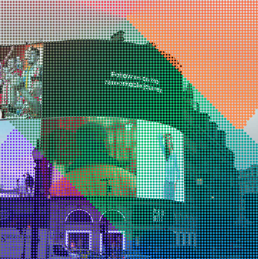
Crafting the Ideal Website Color Palette: Your Guide
Choosing the right color palette for your website is pivotal. It’s not just about aesthetics; it’s a psychological dance that can deeply influence how visitors engage with your content.
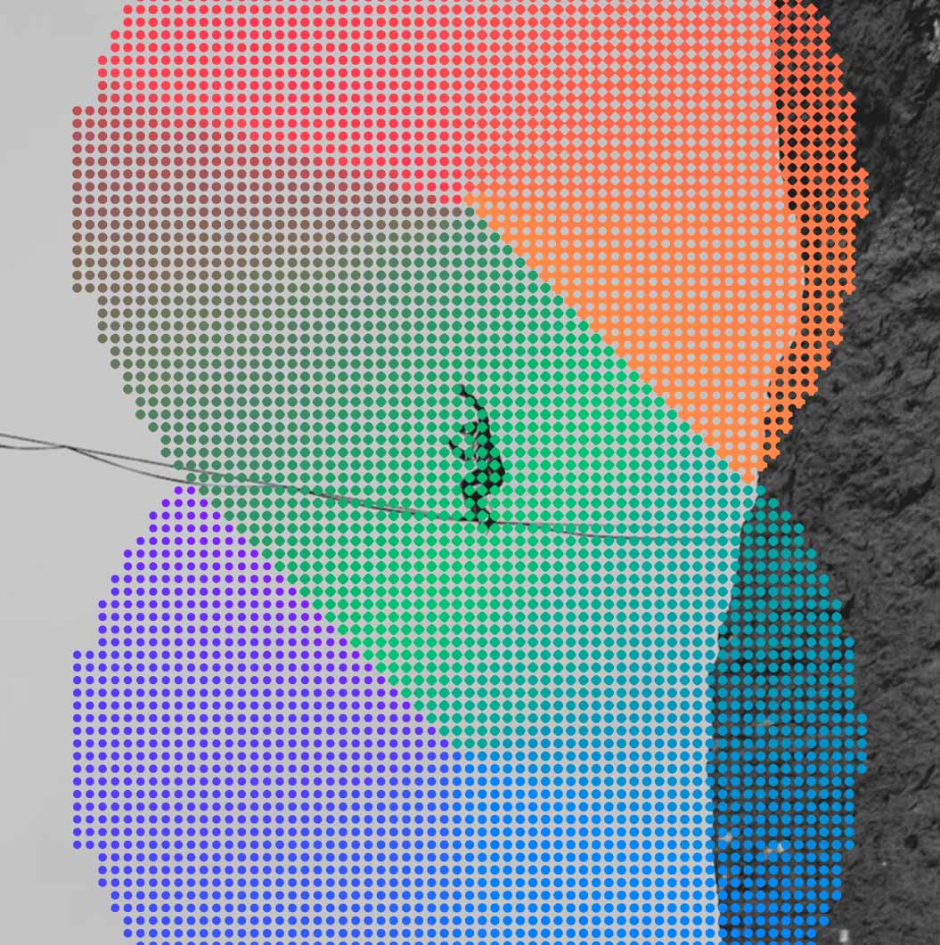
1. The Psychology of Color
Colors evoke emotions and associations. Delve into the psychology of colors to elicit specific feelings from your audience. Calming blues, energetic reds, or trustworthy greens – every shade has a story to tell.
2. Reflect Your Brand
Colors communicate your brand’s personality. Whether it’s a sophisticated grayscale or a vibrant burst of hues, ensure your palette aligns seamlessly with your brand’s identity and values.
3. Consider User Experience
User experience is paramount. Choose colors that enhance readability and don’t clash. Backgrounds and text should be a harmonious match, ensuring a pleasant browsing experience.
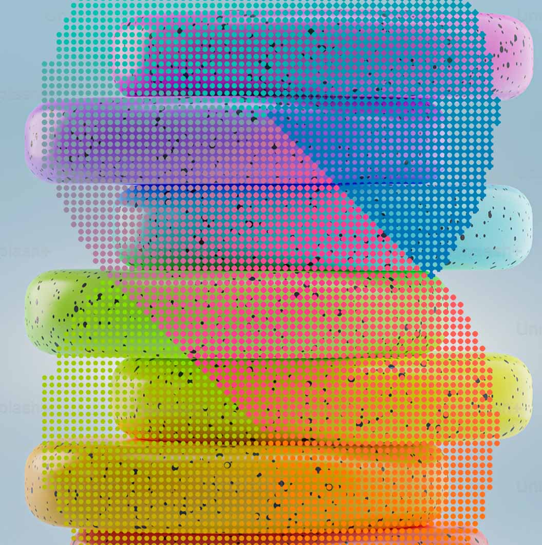
4. Simplicity Wins
Don’t overwhelm with a myriad of colors. Simplicity is elegance. Stick to a primary color and a few complementary shades that guide users’ focus strategically.
5. Test and Iterate
Color preferences vary among audiences. A/B testing can provide valuable insights into what resonates most with your users. Be open to adjustments and fine-tuning.
6. The Power of Contrast
Contrast ensures clarity. Pair light and dark elements for easy legibility. Make your call-to-action buttons pop with a distinct colour that beckons action. You can use an online contrast checker like this one to ensure your content passes accessibility standards.
7. The Final Check
Before launch, view your palette on different devices and browsers. Ensure consistency and accessibility across platforms.
Unlock the Magic of Colors for Your Website
Your website’s color palette isn’t just a visual choice; it’s a strategic one. Harness the psychology of colors, align with your brand, prioritize user experience, and remember – less can often be more.
Ready to transform your website? Take the leap and immerse your audience in an unforgettable color experience. Let your colors tell a compelling story, making your website a hub of engagement and conversion.

Digital Director