Soda
Soda wasn’t just a place to dine out, it was a promise of connection, mood, and hospitality.
- Strategy to harmonise the visions of two hospitality organisations into one
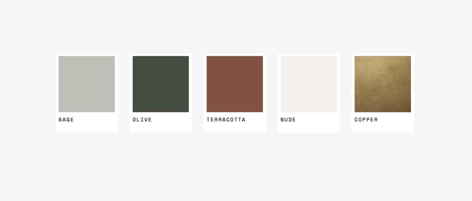
- A brand identity rich in sophistication: a modern logomark anchored by elegant illustrations, indulgent colours, and refined typographic systems
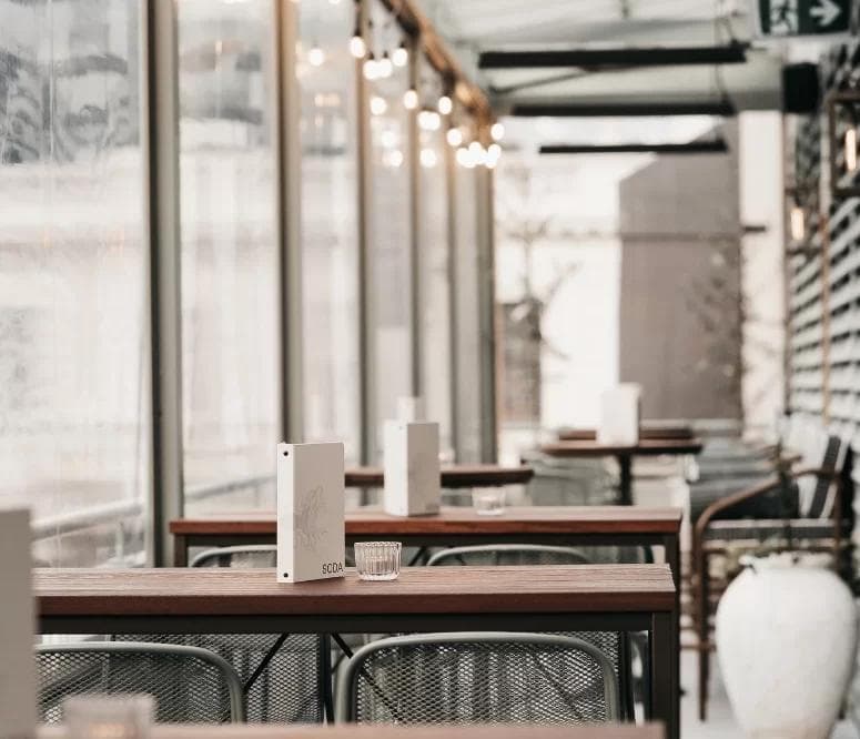
- An immersive brand rollout across menus, signage, and digital touchpoints that makes every detail feel intentional and emotionally resonant
Soda is not just a place to dine; it's a tale of collaboration and transformation.
In this case study, we explore the journey of how two local hospitality companies joined forces to create a dining destination that marries the spirit of Queenstown with the flavours of Spanish cuisine, delivering an experience that is rich in emotion and taste.
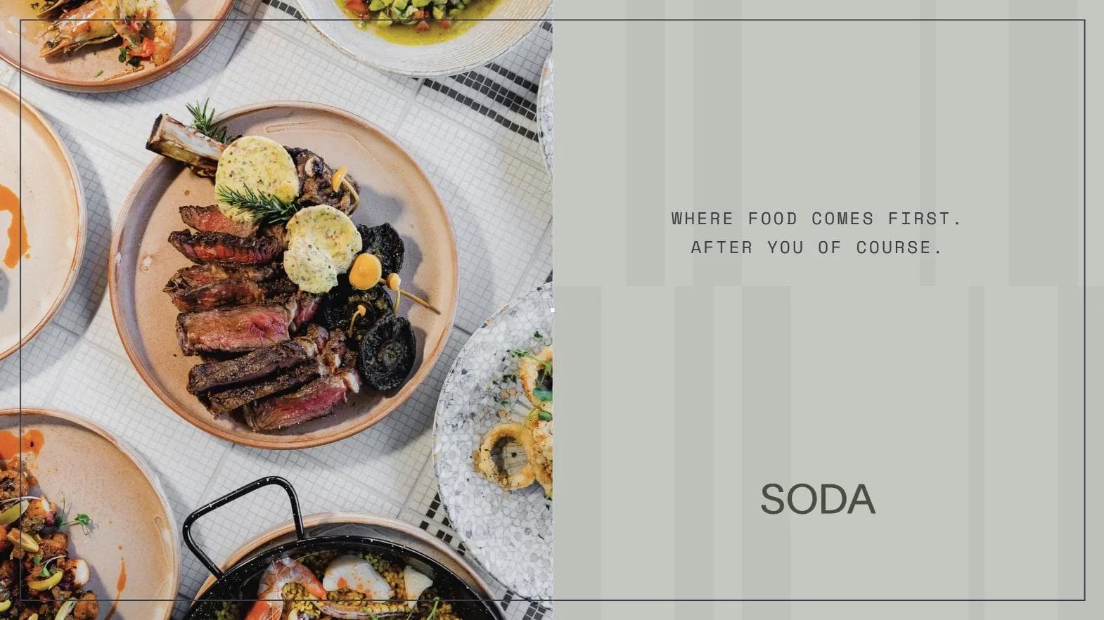
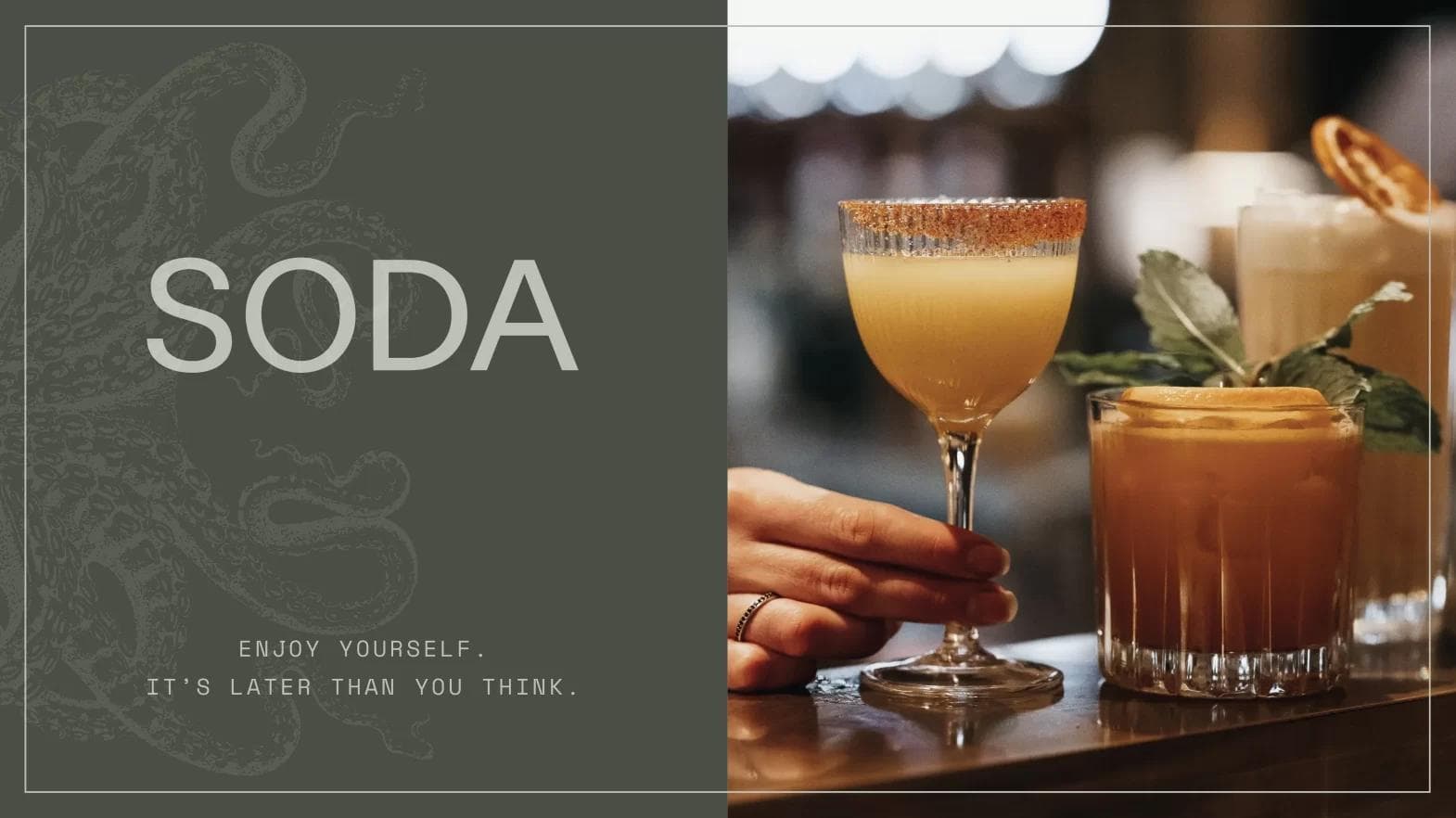
Soda, a haven where you can embrace your true self and leave with a renewed spirit. With a delectable array of dishes, a well-appointed wine and cocktail menu, and a congenial atmosphere, Soda invites you to savour the moment and embark on a gastronomic adventure.
It was a journey of harmonising their distinct voices into a symphony of culinary delight.
Across the world, tables serve as the backdrop for shared stories and cherished moments. The creators of Soda envisioned it as a place where people could come and leave feeling connected. Recognising the profound role that food plays in our daily lives, they aspired to make the dinner table the epicentre of joy and togetherness.
The founders of Soda were no strangers to the hospitality industry, each having decades of experience in their respective niches. However, creating Soda was an opportunity to fuse the unique desires and values of both companies into a single, unified brand that embodied exceptional personalised service.
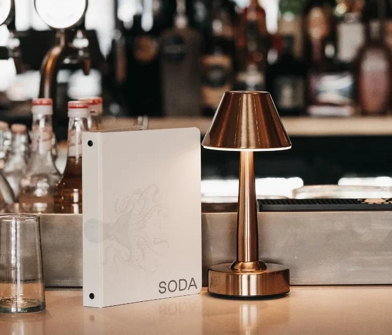
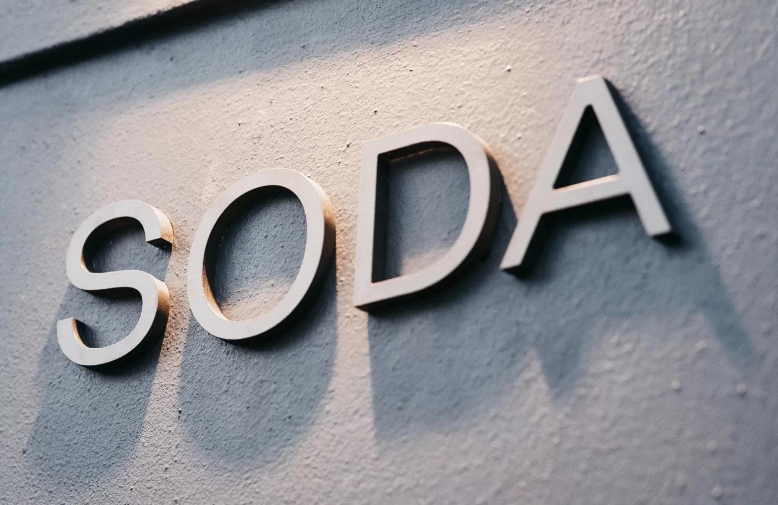
The logomark, although simple and modern, was complemented by intricate illustrations and colour palettes that exuded elegance, comfort, and indulgence—mirroring the essence of Soda.
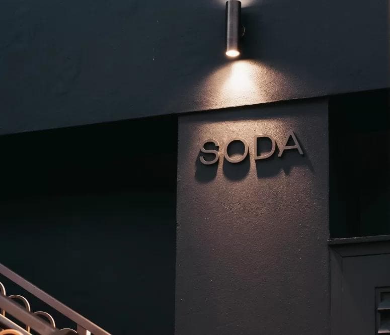
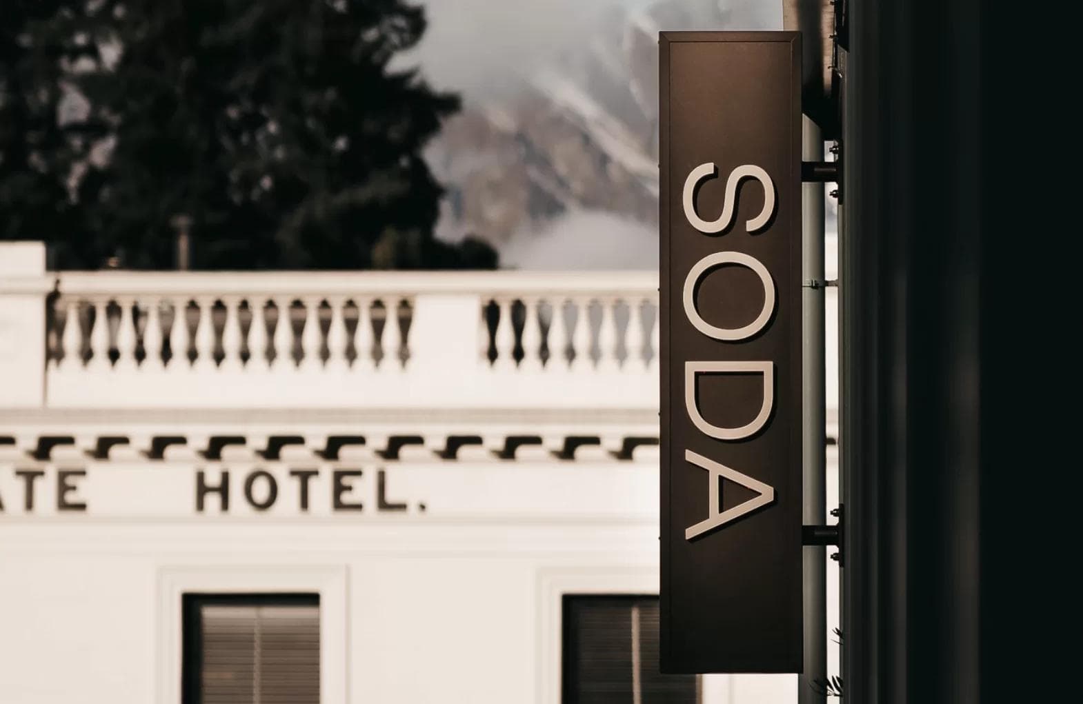
Choosing the right name for the restaurant was no small feat. After an extensive naming journey, ‘Soda’ emerged as the perfect choice. It symbolised energy, vibrancy, and an infectious buzz, making it more of a feeling than just a place. Soda promised a generous ambiance where you could bask in the setting sun or lose yourself in the allure of the night.
Crafting Soda’s brand identity involved a close partnership between Republic Hospitality, People Like Us, and the interior design team at CTLR Space. Together, we breathed life into a concept that astonished at every turn.
Looking for results like these?