Gents Barbershop
What we delivered
strategy / brand
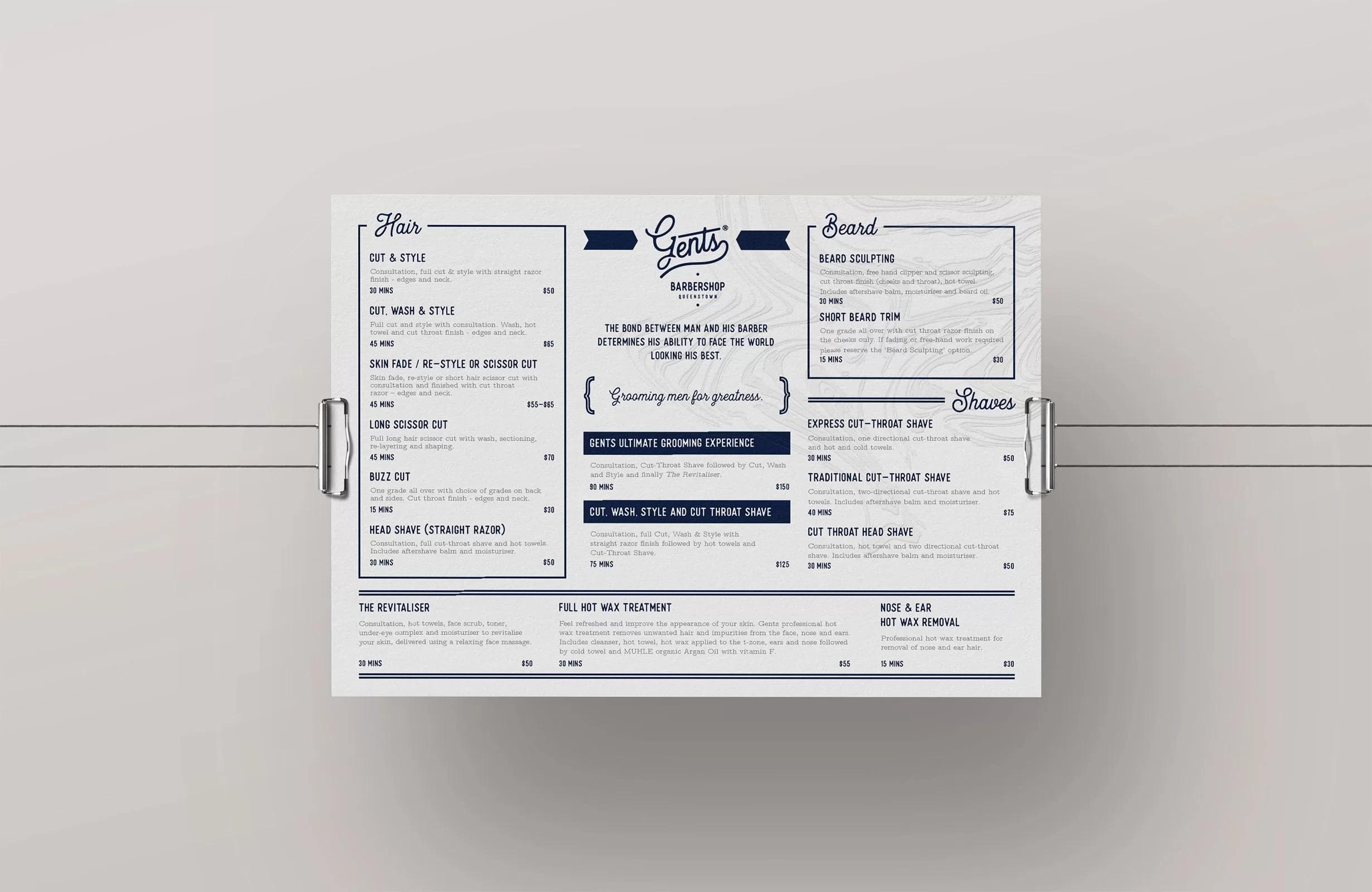
Gents wanted to stand apart as more than a barbershop, an escape for modern gentlemen. We built a timeless identity that matched their vision for quality and connection.
- Developed a timeless brand identity with a classic English aesthetic
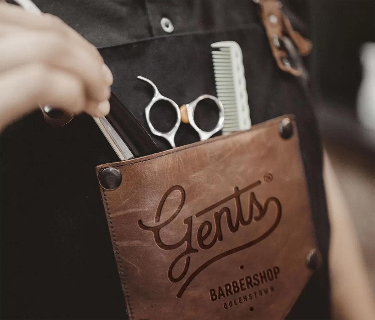
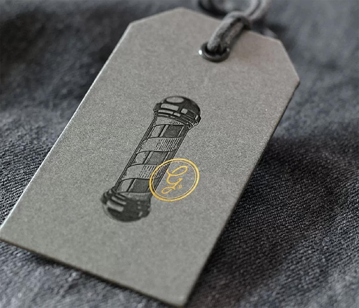
- Created a versatile logo system adaptable across apparel, packaging, and retail products
- Produced tactile brand assets, from woodgrain-embossed business cards to premium packaging and apparel
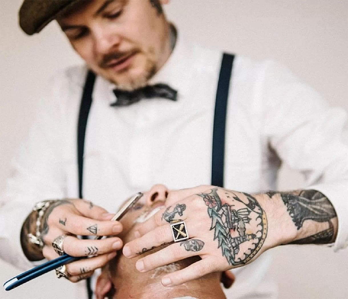
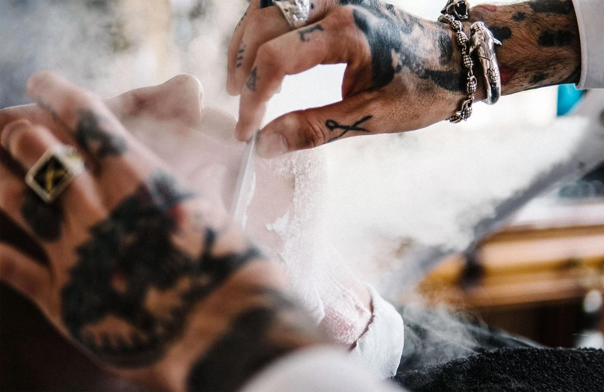
- Ongoing content creation and photography to capture the atmosphere, service, and detail of the Gents experience

Recognizing the founders’ aspirations for expansion, we understood the need to create a brand that customers could truly embrace, one that would be adaptable and scalable.
With a classic English aesthetic and shelves lined with fine imported goods, Gents Barbershop and men’s emporium brings tradition and charm to the heart of Queenstown. Every cut exudes precision, quality and style. It’s no wonder you might find it difficult to walk-in and expect an available appointment. Their standards are high and their waiting list is long.
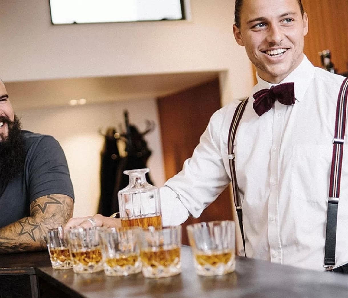
There are a few things you’ll notice the moment you step into Gents. The air is buzzing, the men are chuckling and you’ll wonder what kind of secrets are being exchanged those barber chairs. Similar to a woman and her hairdresser, the bond between a man and his barber is a loyal one. There’s few places nowadays the modern man can come to chat and sip on a 10yo whisky while basking in the steam of a cutthroat shave. This is one of those places, like a sanctuary for men. The antique finishings, the gentleman’s lounge and antique barber stations all speak to a single mission… quality.
CLIENT TESTIMONIALS
“I was really impressed with the ladies’ ability to immerse themselves into such a masculine industry and really dig deep to understand what our clients want and need from their barbershop experience. They pulled through that timeless barbershop look with a modern sense of style.”
Drew Mitchell | Gents Barbershop
Founder & Director
The logo we designed for Gents exudes timelessness, employing a color palette of natural tones and a rich, deep blue—a classic choice for barbershops. It resonates with customers, evoking a sense of nostalgia.
We delved into the desires of busy working men and discovered that they craved an escape—a place to sip a a whisky, engage in conversation, and have their grooming needs taken care of. Gents set out to differentiate itself through thoughtful touches throughout the entire experience. From a complimentary barista coffee with every service to a premium bar and a retail shop stocked with exquisite imported men’s products, Gents never ceased to surprise and delight its customers. And that’s exactly the approach we took with the branding—attention to detail and the desire to bring joy to each interaction.

Today, Gents stands amongst the ultra-premium barbershops in New Zealand, and we take immense pride in having contributed to their growth and success.
If you’ve ever held a Gents business card, you’ll know you’re in for an exceptional experience. We crafted each card with delicate woodgrain embossing on a regal-inspired paper stock. Every detail exudes quality and communicates a sense of refinement.
From packaging to apparel, we created multiple versions of the logo to accommodate the growing company’s diverse applications while maintaining a cohesive brand presence. Additionally, our strategic and stylish content creation keeps Gents one step ahead of the competition. Through our photography, we capture the essence of the shop and its services, effectively conveying their standards and beautifully complementing their brand identity.
The impact of our collaboration with Gents has been nothing short of remarkable. Since the rebranding, the barbershop has doubled in size, utilizing its versatile visual identity to expand its range of men’s retail products, including branded beard oils, balms, and apparel. Clients feel emotionally connected to Gents, fostering brand loyalty, client retention, and, most importantly, ensuring a consistently fully booked barbershop.
Looking for results like these?
