Coterra
Coterra needed a new brand and website that celebrated their legacy and announced their future. We gave them both.
- Discovery and strategy grounded in their core values to anchor the brand’s new positioning
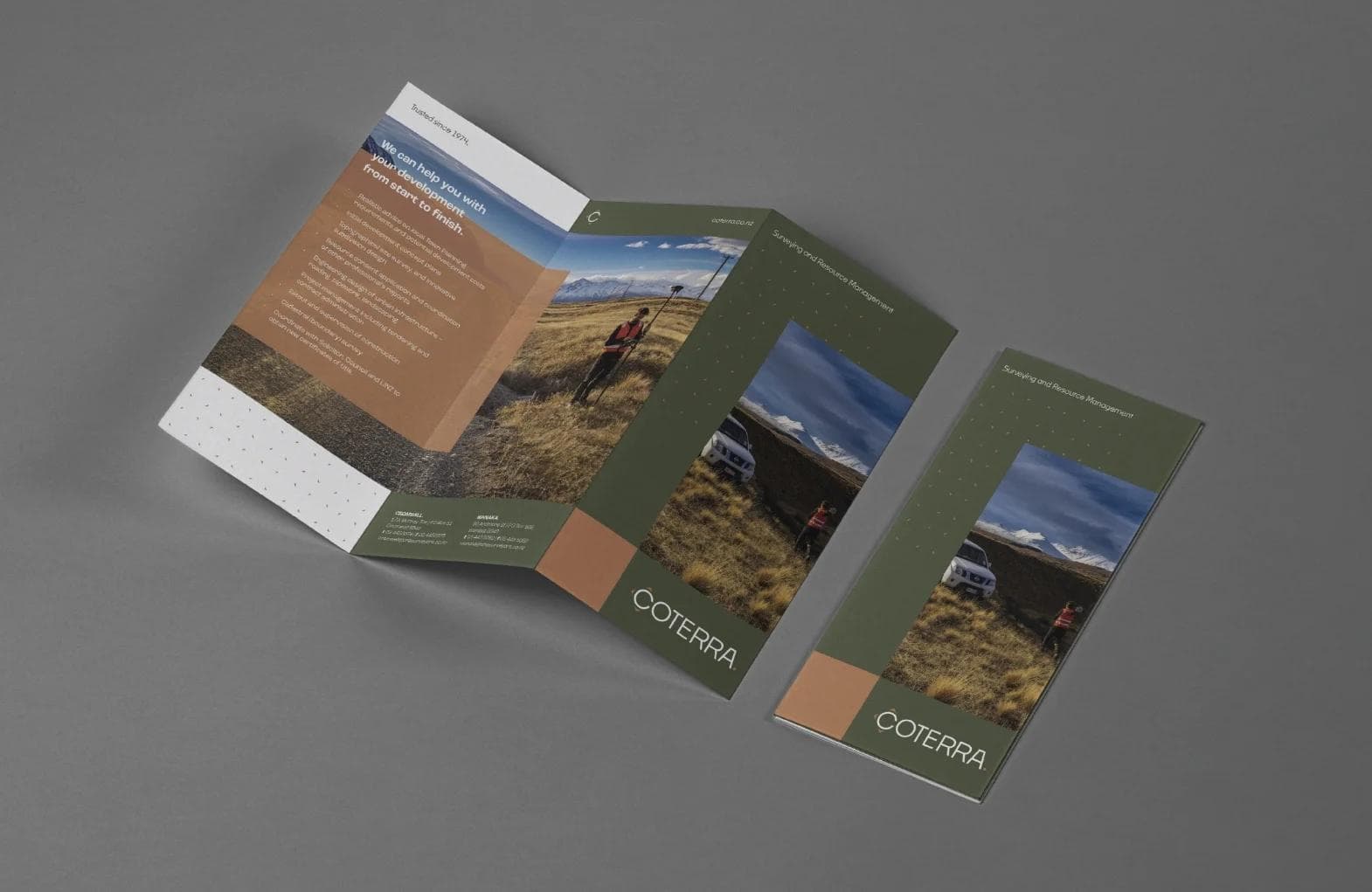
- Visual identity rooted in Central Otago’s landscape, blending earthy tones and clean design elements for professionalism and approachability
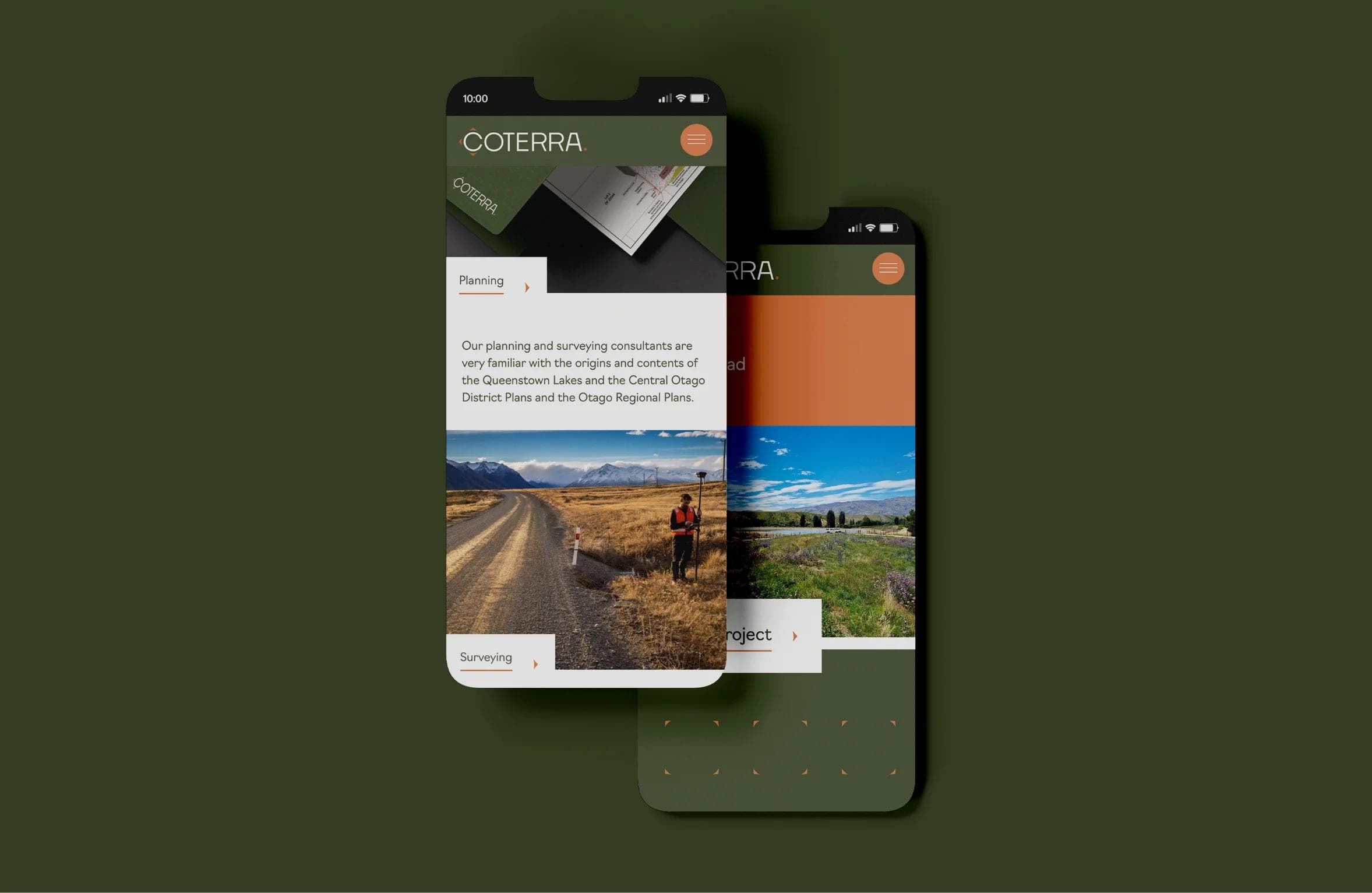
- A user-first website built to showcase their services and project portfolio with confidence, clarity, and thoughtful interactive details
Proof no promises
30+ years in business, finally matched by a brand worth showing off
↑20x increase in average engagement time — from 15 seconds to over 5 minutes
↑163% growth in active users in the first month on the new domain
↓47% drop in bounce rate — from 50.7% to 27%
Redefining Coterra—precision, expertise, and a new brand era.
For more than three decades, Coterra has been a cornerstone of Central Otago’s land development and surveying industry. Known for their meticulous work and deep regional knowledge, their reputation was well-established. However, as the business evolved, it became clear that their identity no longer reflected the innovation and forward-thinking approach that had propelled their success. It was time for a change, and Whitelaw Mitchell was brought on board to lead the transformation.
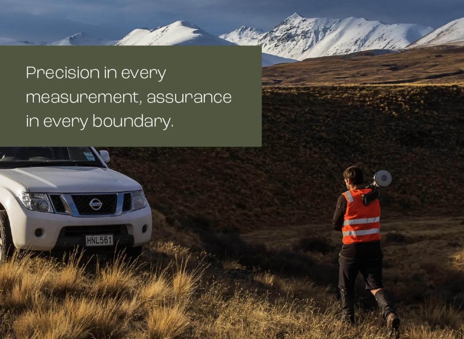
The journey began with strategy. Through workshopping and in-depth discovery, we uncovered what made Coterra distinct: their unrivaled precision, integrity, and commitment to collaboration. These insights became the foundation for the new brand, guiding everything from visual identity to messaging. We developed a clear ethos that positioned Coterra as not just trusted experts, but as partners who see the potential in every piece of land and every client relationship. This ethos was encapsulated in the tagline, “Precision in every measurement, assurance in every boundary,” reflecting their legacy and their future.
The visual identity needed to strike a balance between honoring their history and embracing modernity.
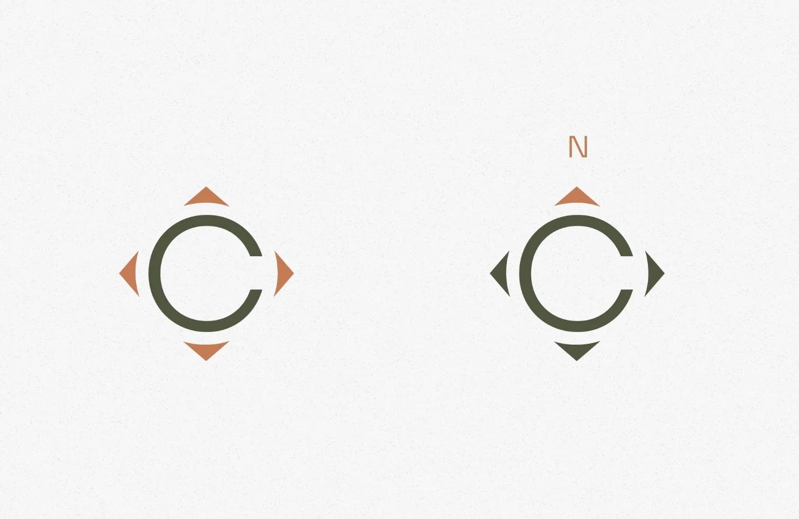
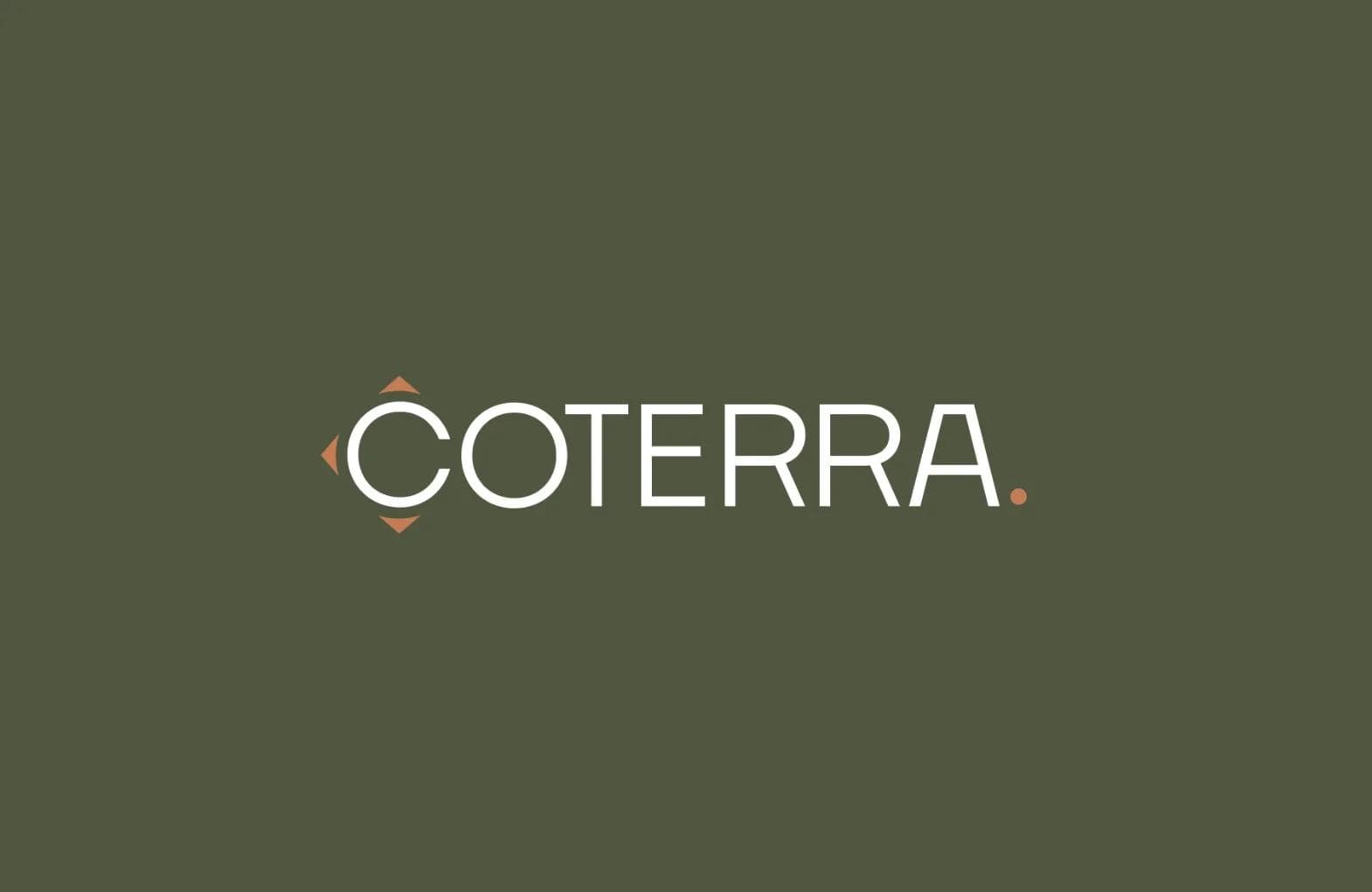
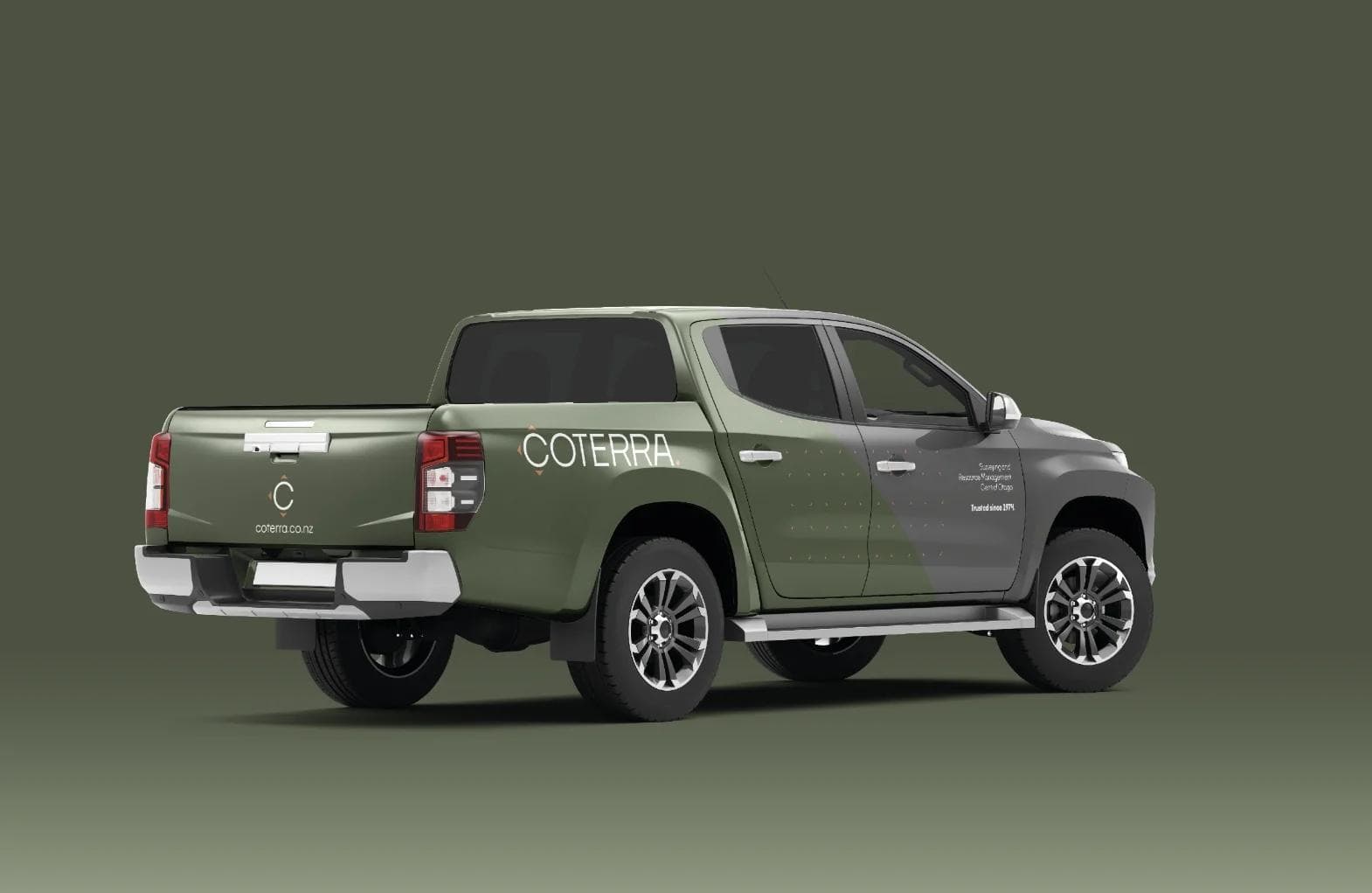
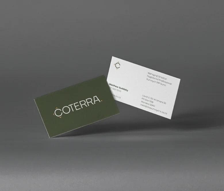
Inspired by the landscapes of Central Otago, the brand’s earthy tones and clean design elements conveyed a sense of professionalism and approachability. The new logo marked a bold departure from the past, symbolizing both the technical precision of their work and their connection to the land.
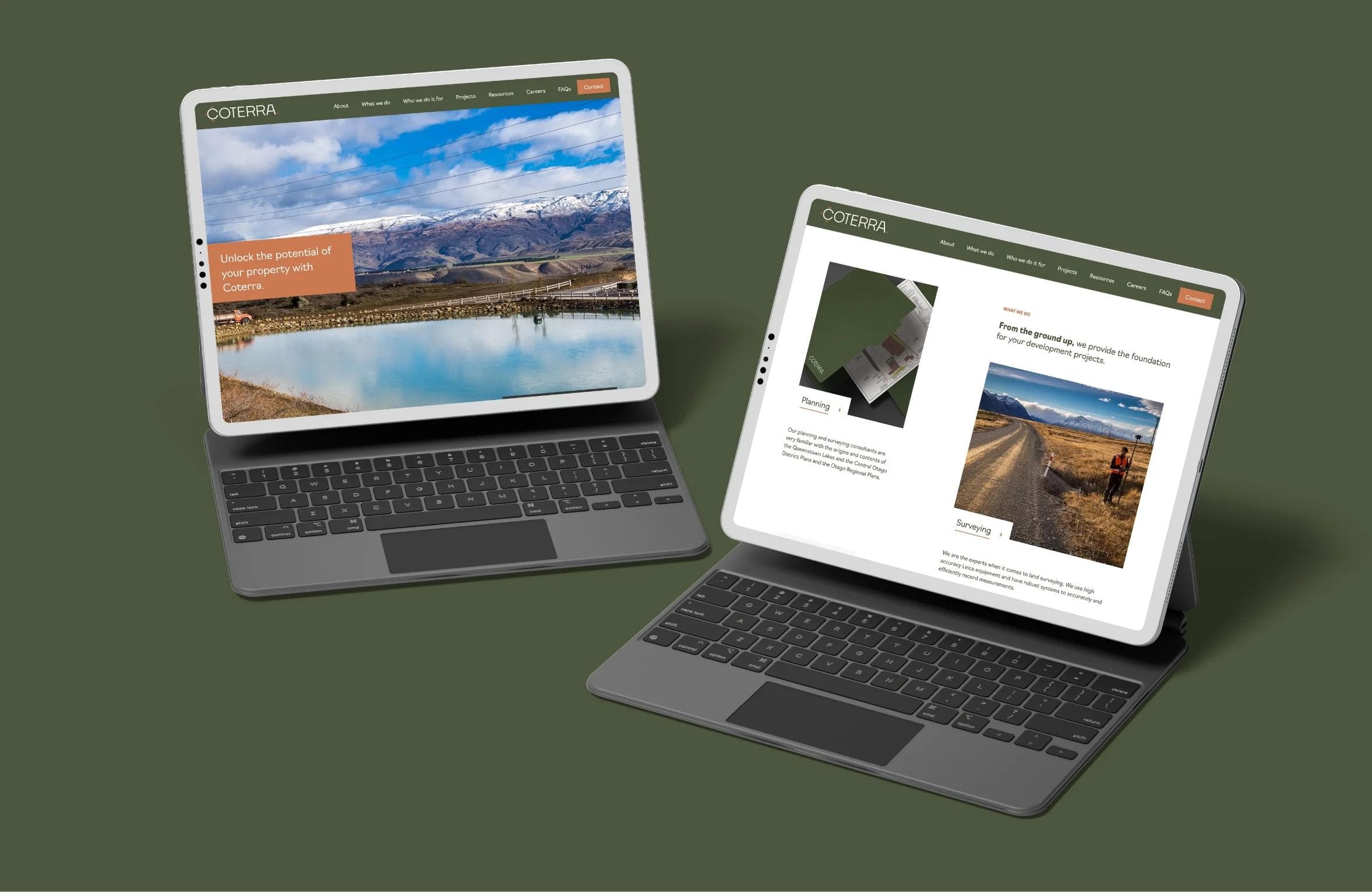
With the brand identity established, we turned to the website, crafting a digital platform that brought Coterra’s values to life. The design was clean and functional, emphasizing user-friendly navigation and clear communication. Each page was meticulously crafted to highlight their core services—planning, surveying, and land development—while showcasing their impressive portfolio of completed projects. Subtle design details, like bespoke imagery and interactive elements, reflected the care and precision Coterra brings to every client interaction.

Coterra now stands ready to lead Central Otago’s land development industry into the next era, with a brand as precise, trusted, and enduring as the people behind it.
In the first month after launch, active users nearly tripled, average engagement time jumped from 15 seconds to over 5 minutes, and the bounce rate dropped by nearly half, clear signs that the new Coterra brand and site were landing with the right audience.
For the team at Coterra, it was a moment of pride, with a brand and digital presence that felt as professional and capable as the work they do every day.
Looking for results like these?