Dart Engineering, a premium engineering firm based in Queenstown, has earned a reputation for delivering innovative and reliable solutions to quality-conscious customers.
Their expertise spans commercial, residential, and industrial projects, with a particular focus on stainless and aluminium applications. An exciting chapter in their journey began with the expansion to Dunedin, where they opened a new shop and a larger facility to better serve key customers across Otago.
With the expansion to Dunedin, Dart Engineering recognised the need for a brand refresh to align with their evolving identity. The creative journey commenced with thorough market research, aiming to understand the unique dynamics of the Dunedin market compared to the familiar Queenstown market.

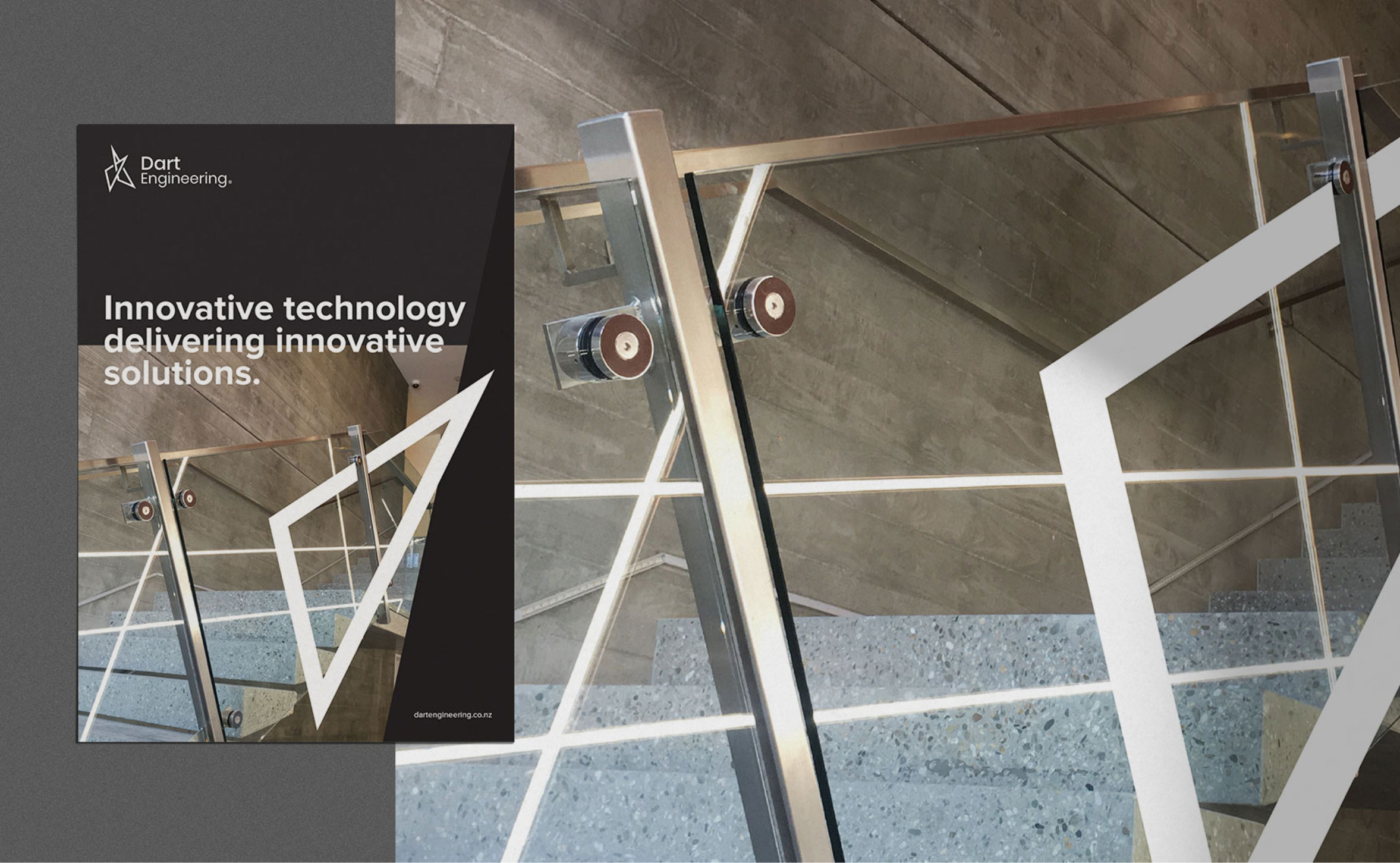
The brand refresh sought to infuse modernity and technology into their image, differentiating Dart Engineering from more traditional engineering firms.
Our Seed Strategy Workshop uncovered valuable insights. The Dunedin market appeared more reserved and risk-averse, presenting a unique challenge. To make the brand refresh a success, it was clear that the new brand identity had to appeal to all demographics, reflecting Dart Engineering’s history in Queenstown while also resonating with the new Dunedin market. Moreover, as Dart Engineering ventured into new territory, creating a memorable and bold presence was essential.
The goal was to shed the old-fashioned, outdated image associated with the industry and embrace a bold and modern identity, reflecting their technological leadership. Expanding into new territories involves inherent risks, and Dart Engineering needed a brand that would be adaptable across multiple regions. The approach was to convey their expertise and reputation while setting the tone for a modern and dynamic brand.
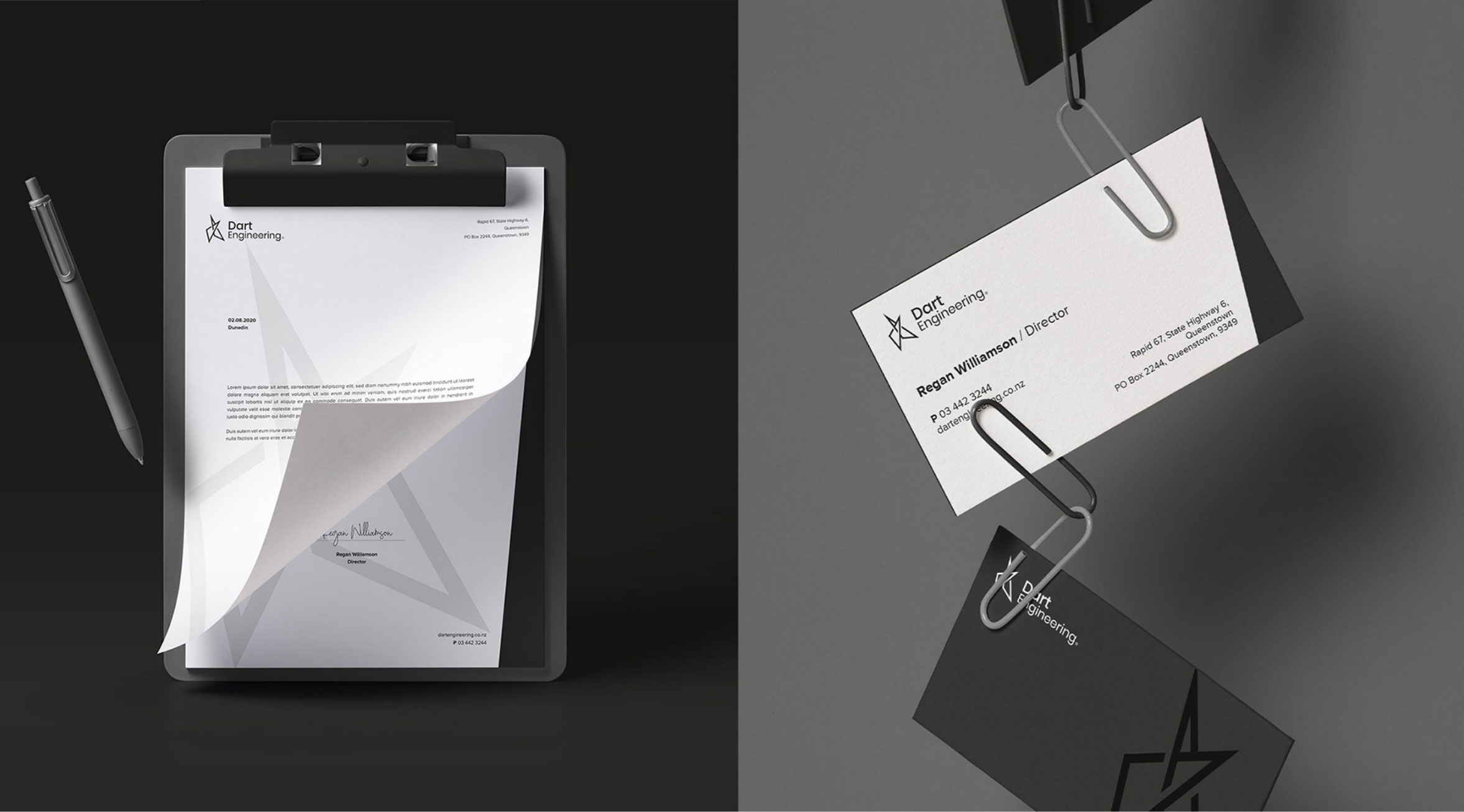
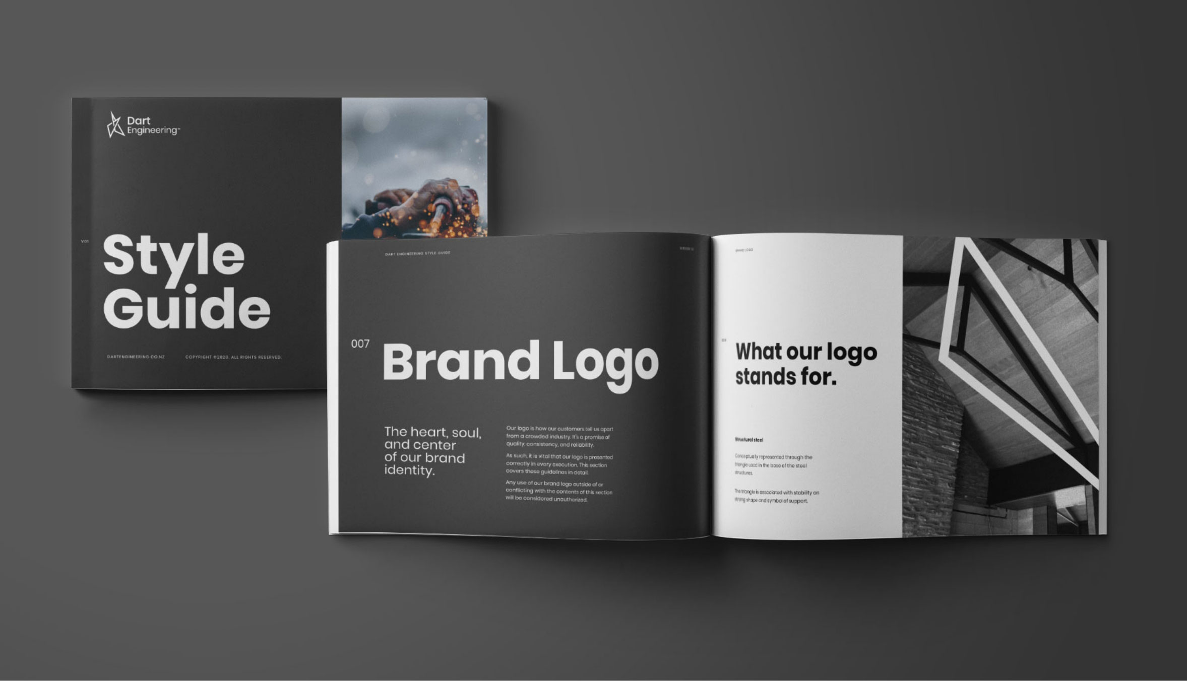
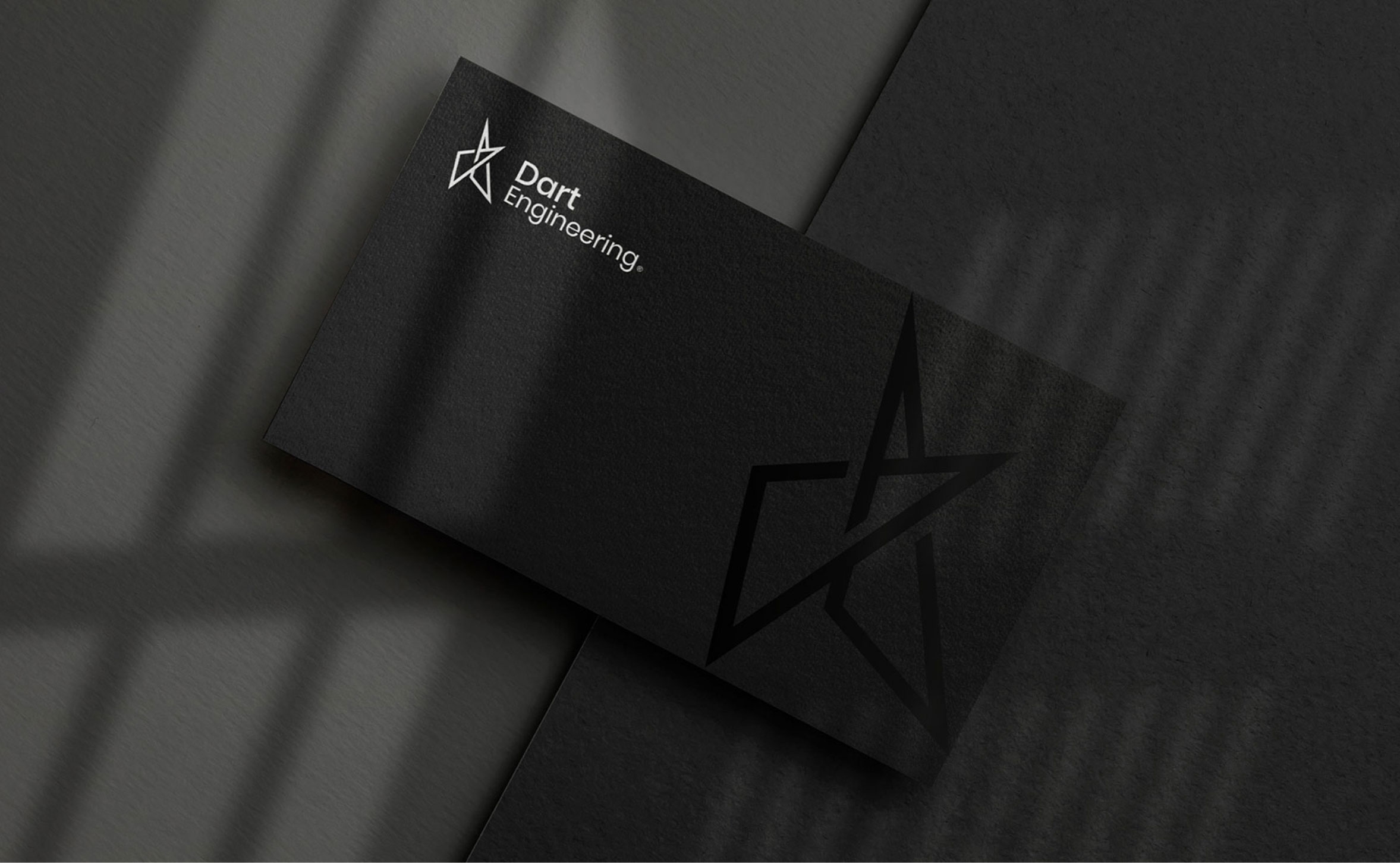
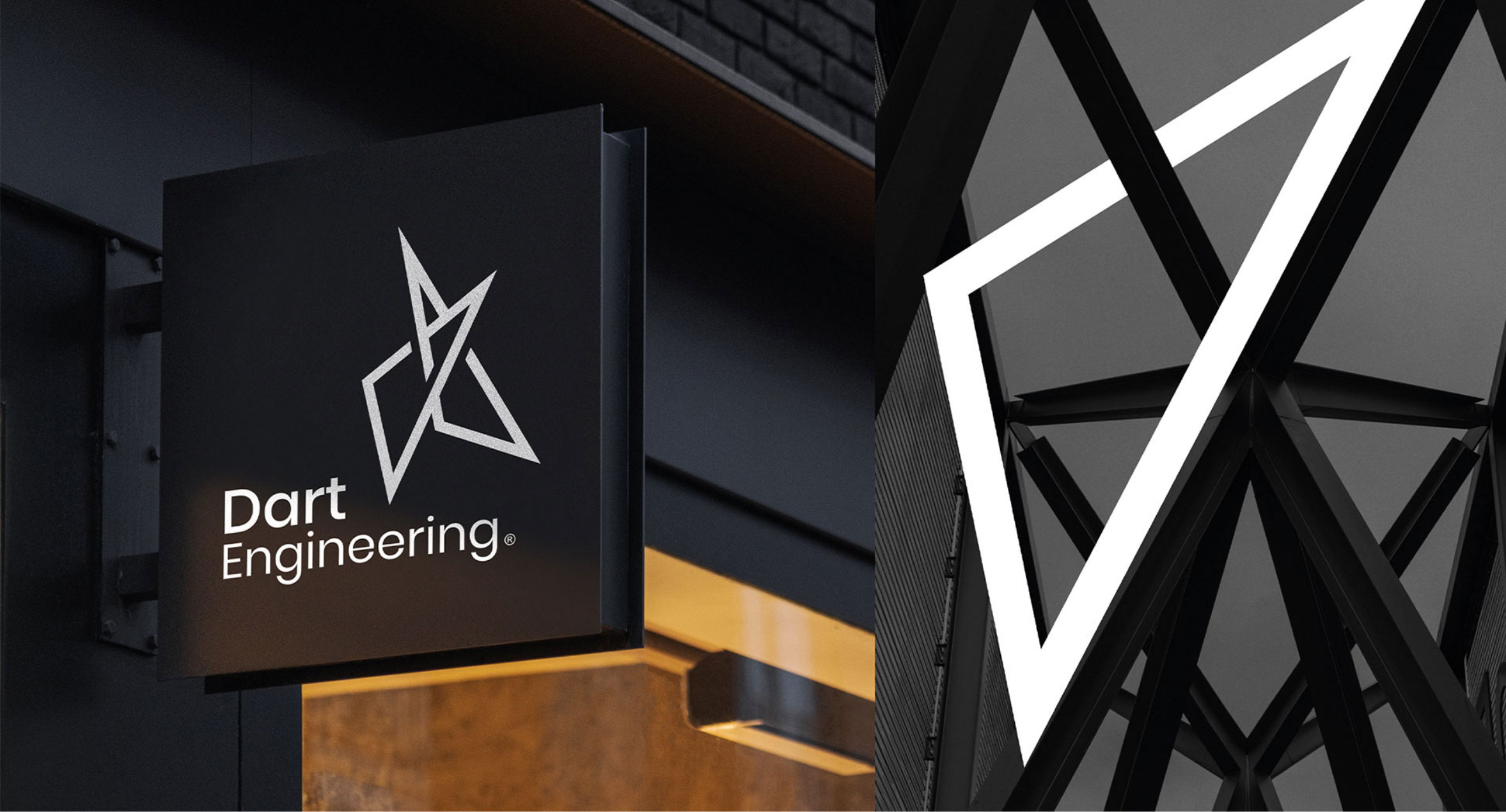
Inspired by the structural strength of triangles, frequently used in construction for their stability and ability to withstand pressure, the brand icon was born.
It symbolised stability, strength, and support – core attributes of Dart Engineering’s work. A clean and modern typeface was chosen, complemented by a high-contrast palette and sharp lines, resulting in a brand identity that conveyed modernity and expertise.
The brand transformation made more than just a splash; it turned into a wave. The new signage on the high-traffic section of Frankton Rd in Queenstown garnered attention and praise from both the engineering community and beyond. Long-standing customers embraced the brand refresh, as it paid homage to Dart Engineering’s history and track record while signalling a bold new direction.
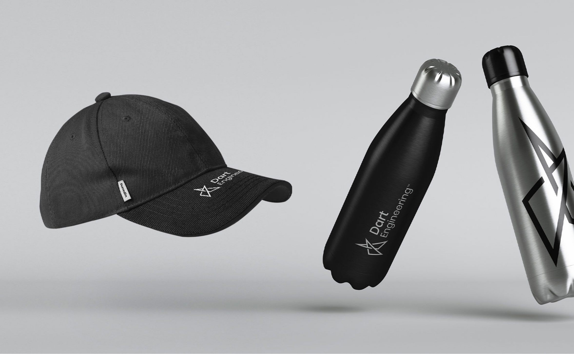
In the Dunedin market, the entrance was seamless. Dart Engineering boldly announced its arrival with new storefront signage, and the team eagerly embraced the new branding on work uniforms, merchandise, and in digital marketing efforts. With a website refresh still on the horizon, the prospects for brand awareness and market expansion across Otago and beyond look promising.
Dart Engineering’s brand transformation successfully addressed their need for a modern and dynamic identity that aligned with their reputation for innovation and reliability. The refreshed brand not only captures their technological leadership but also lays a strong foundation for their future endeavors, making waves in the engineering industry.