Roost, a prominent mortgage broker franchise in New Zealand, needed to navigate the task of redefining their brand for the local market while maintaining the essence of the established national brand.
The brand and its marketing materials were originally designed by Roost’s national head office and distributed to each franchise location. However, the local franchise in Queenstown found itself grappling with inconsistency across the board. Issues ranged from disparities in colours to messaging and an outdated logo, resulting in a visual identity that was unclear and disorganised.
Upon closer examination, we recognised that there were hidden gems within the existing brand elements and messaging. We understood that these valuable aspects needed to be unearthed, polished, and brought to the forefront to make a powerful statement.
Rather than opting for a complete departure from the existing branding, we chose a more subtle approach – a facelift that retained some valuable elements.
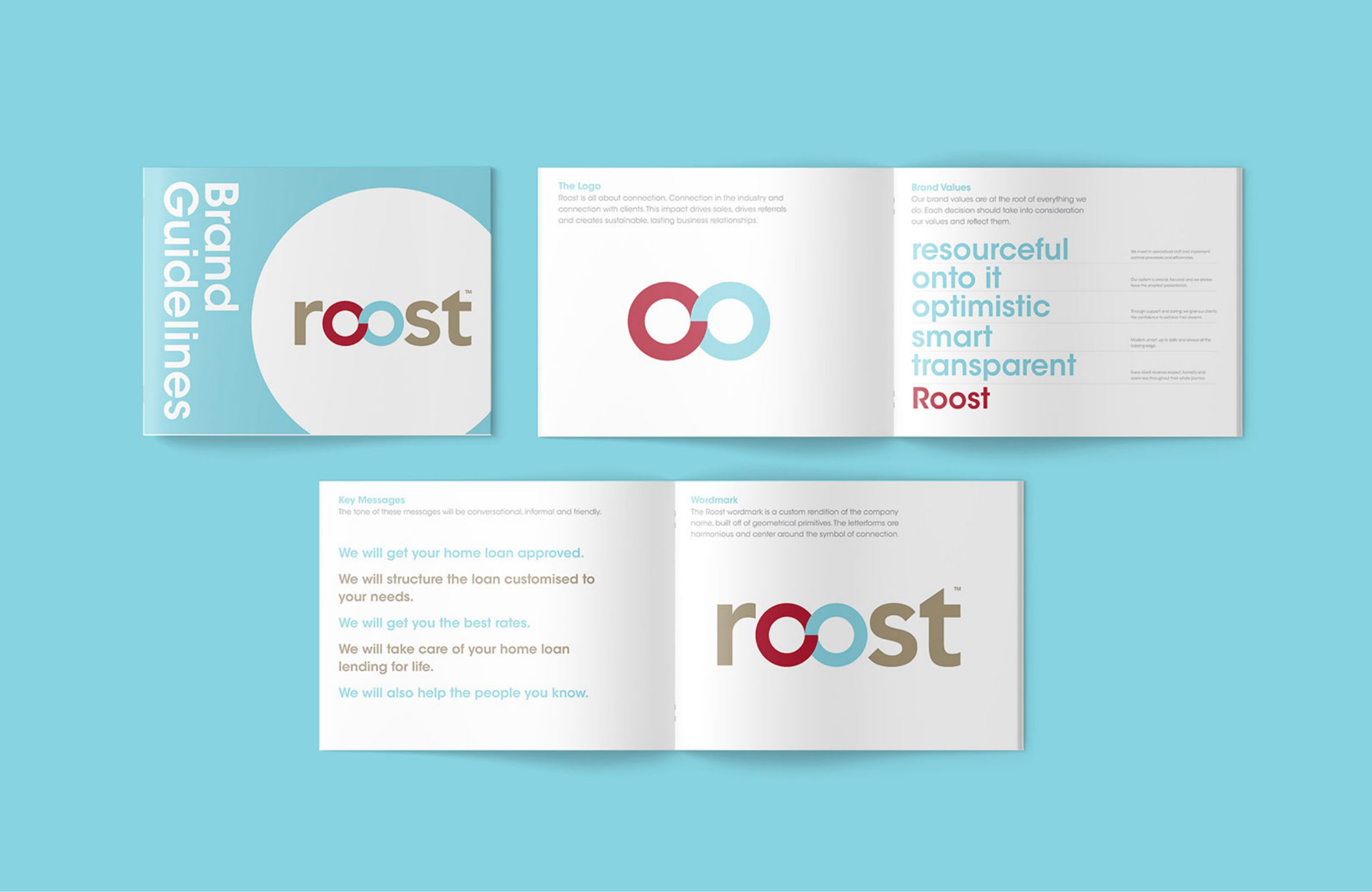
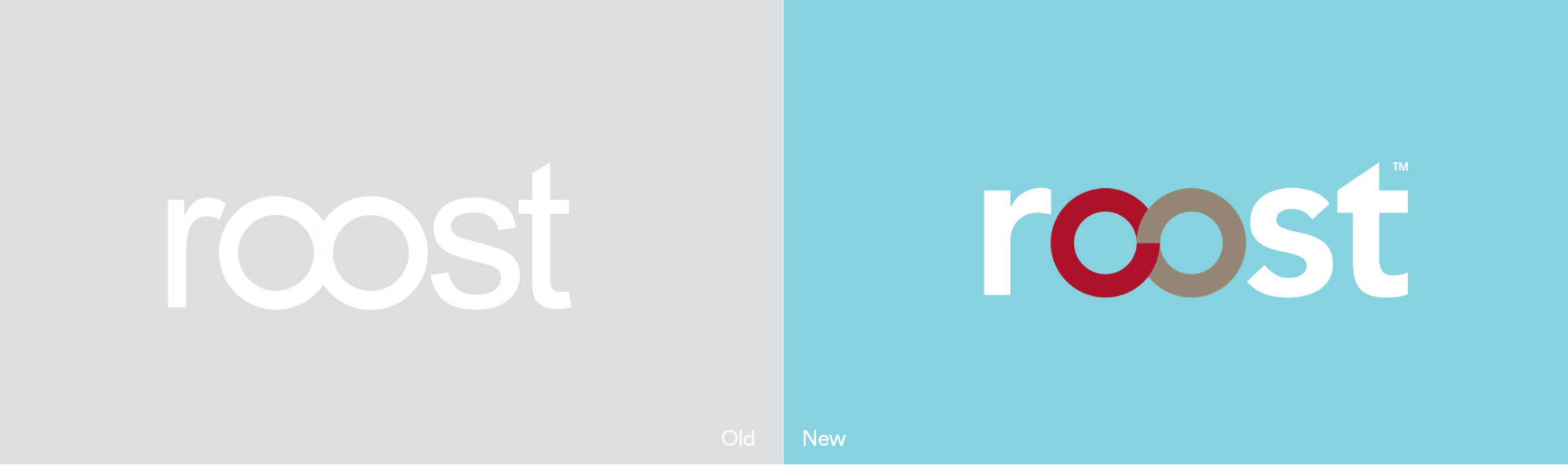
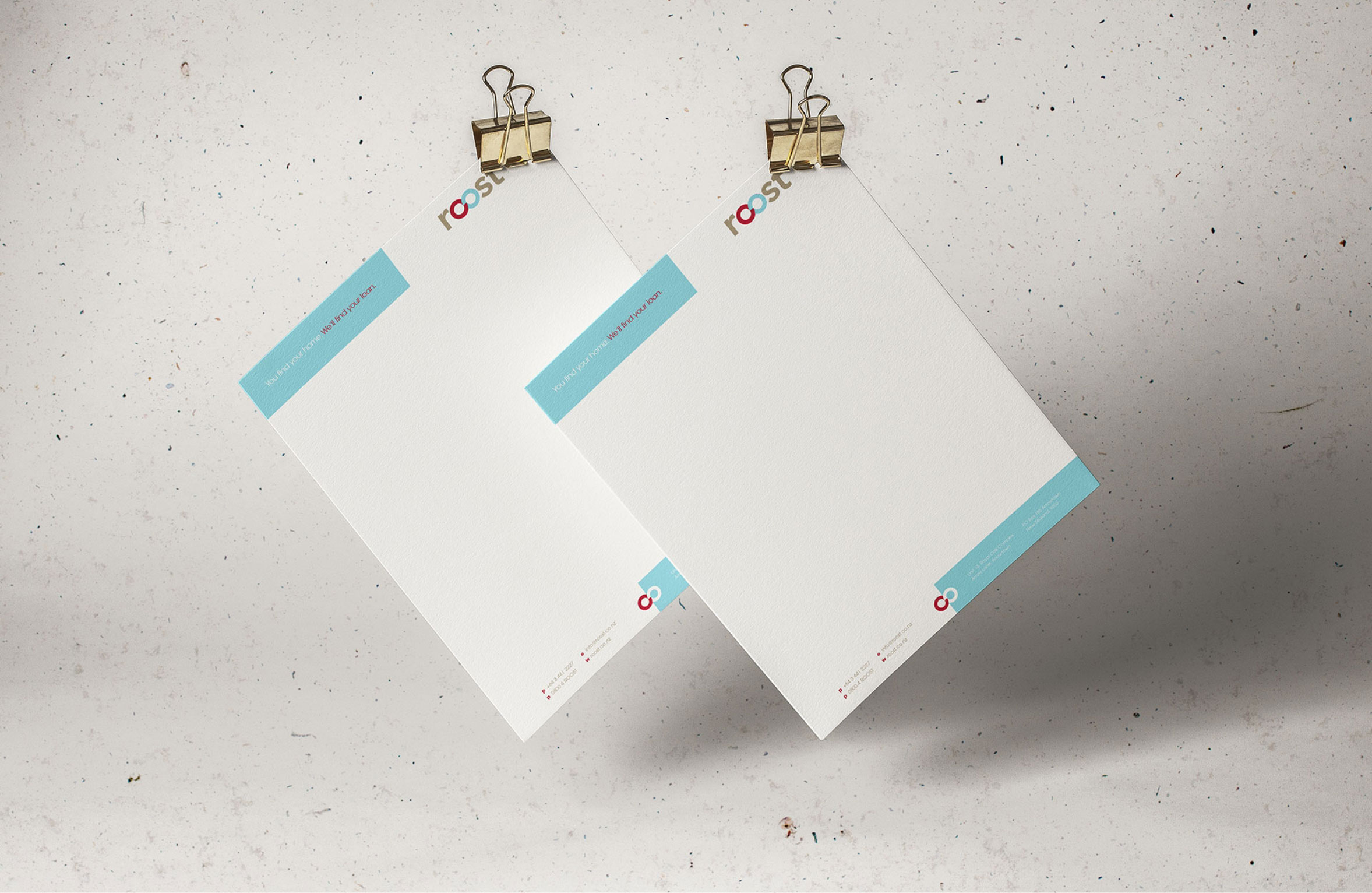
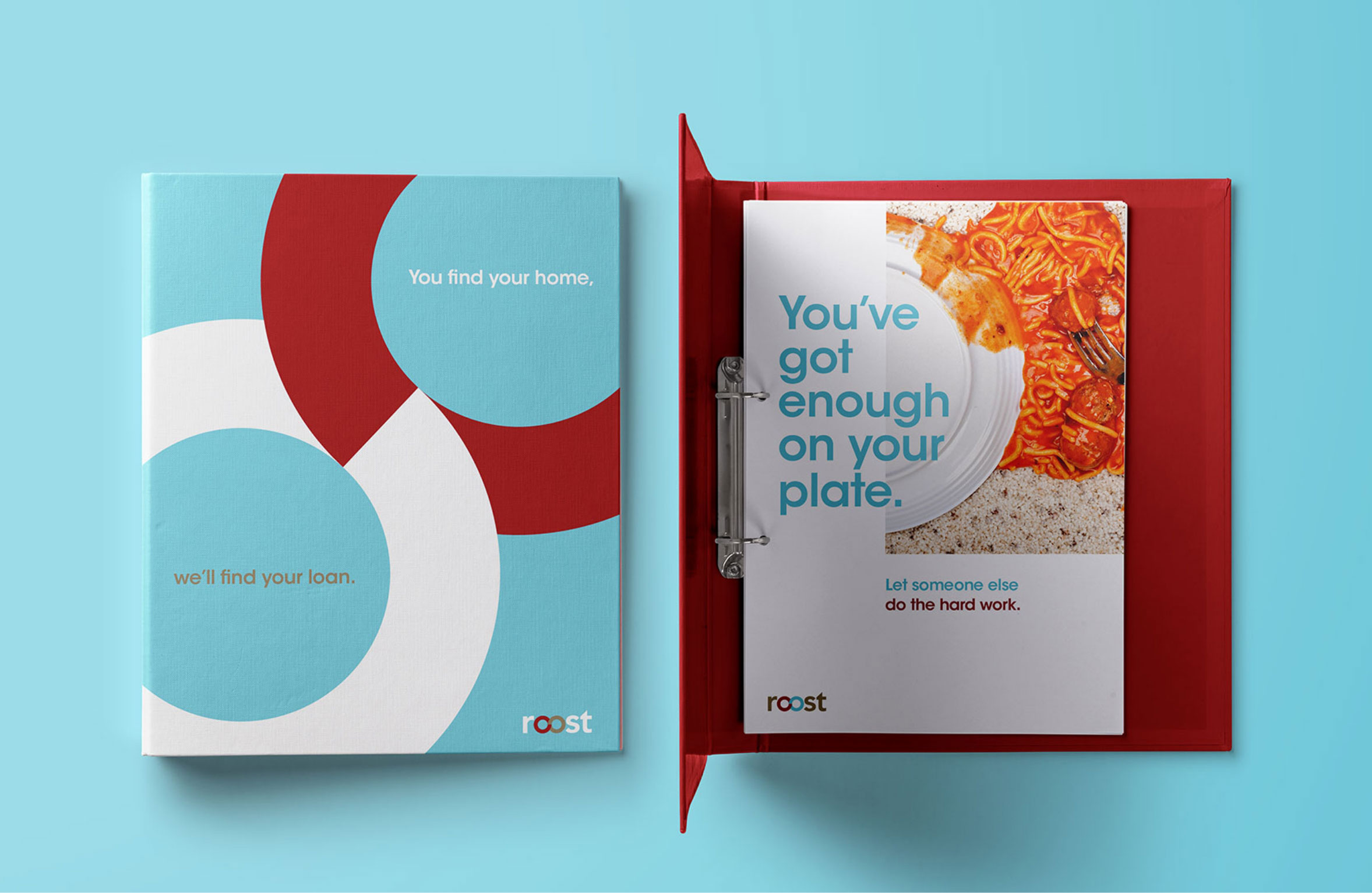
The logomark required a soft facelift to avoid looking dated. We developed a new visual identity system centred around the Avant Garde typeface, which conveyed a sense of timelessness and modernity. This choice reestablished a visual connection across all of the brand’s marketing materials, resulting in a more cohesive appearance.
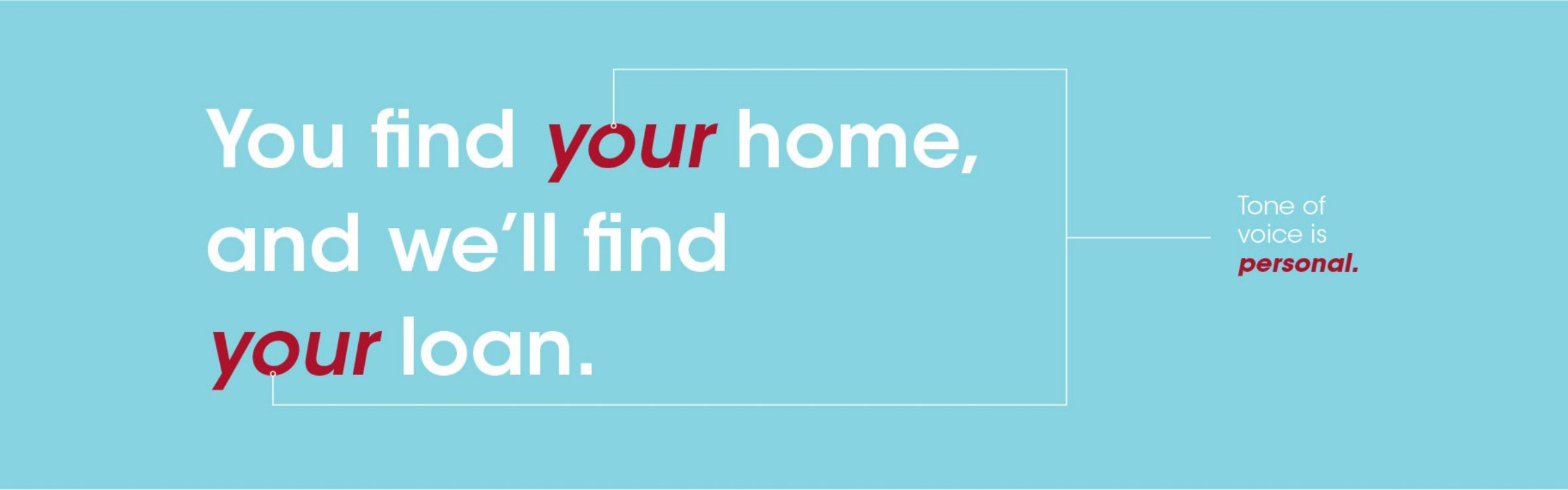
To enhance Roost’s relatability, we redefined their voice and messaging, shifting from a corporate tone to a more personal and approachable personality. A slight adjustment to their tagline underscored this change, emphasising a lending perspective that helped them connect with their audience on a deeper, more human level.
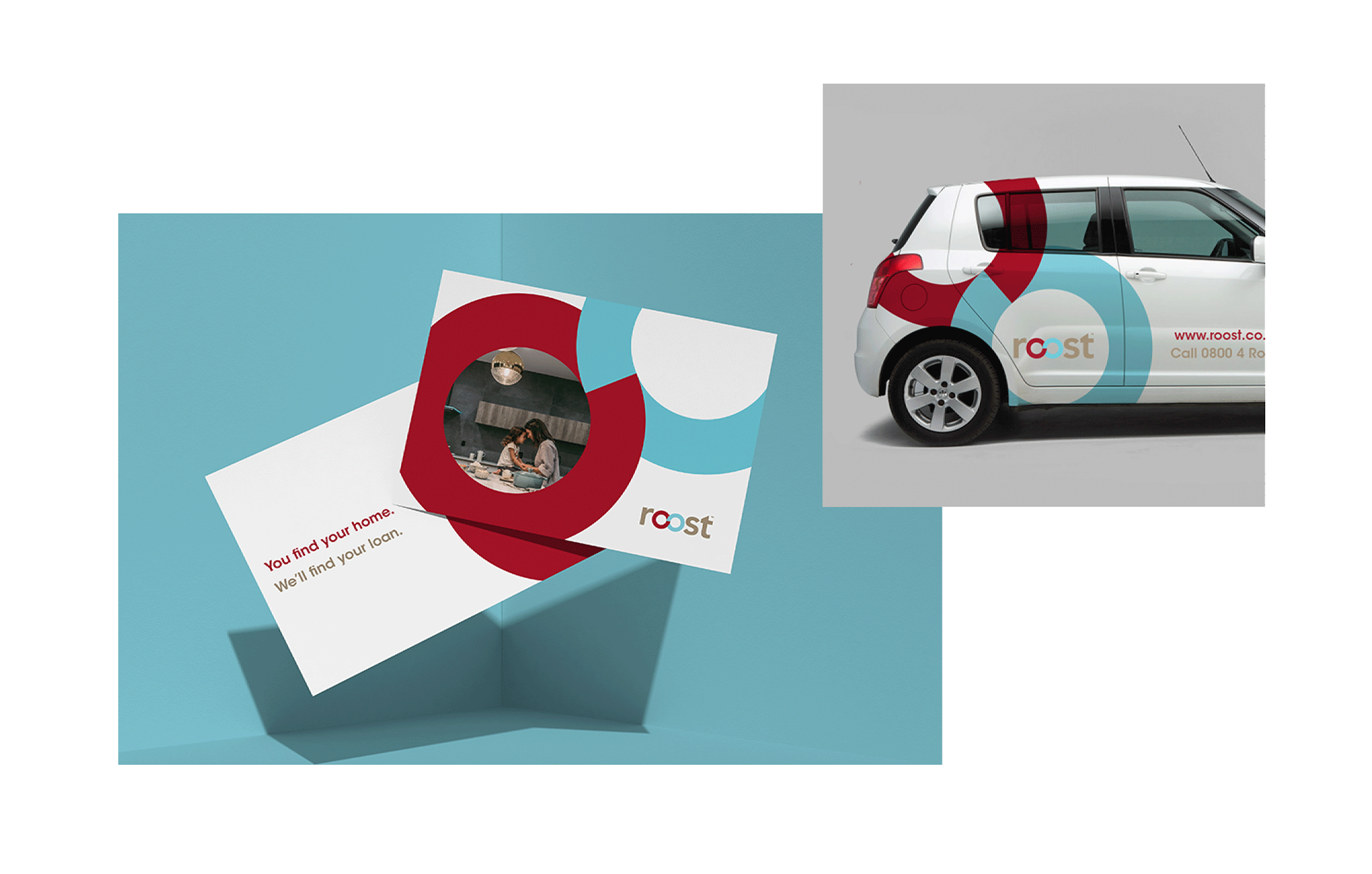
Once the new core brand strategy was in place, we conducted a comprehensive refresh of their marketing materials, establishing new brand style guidelines, a visual identity system, and creating vehicle and wayfinding signage to maintain consistency.
Our approach struck a balance between addressing our client’s pain points and leveraging the strengths inherent in the brand they had acquired.
Instead of pursuing a complete rebranding process, we recognised the value in the existing brand and aimed to make subtle yet impactful changes. The result was a brand evolution that retained its essence but became more cohesive, relatable, and effective.
Through these carefully strategised changes, Roost Mortgage Brokers were able to revamp their brand presence in the local market without losing the essence that had already made them a recognisable name in the industry. In this case, “less is more” held true, as the brand’s impact and effectiveness increased through a refined and focused approach.