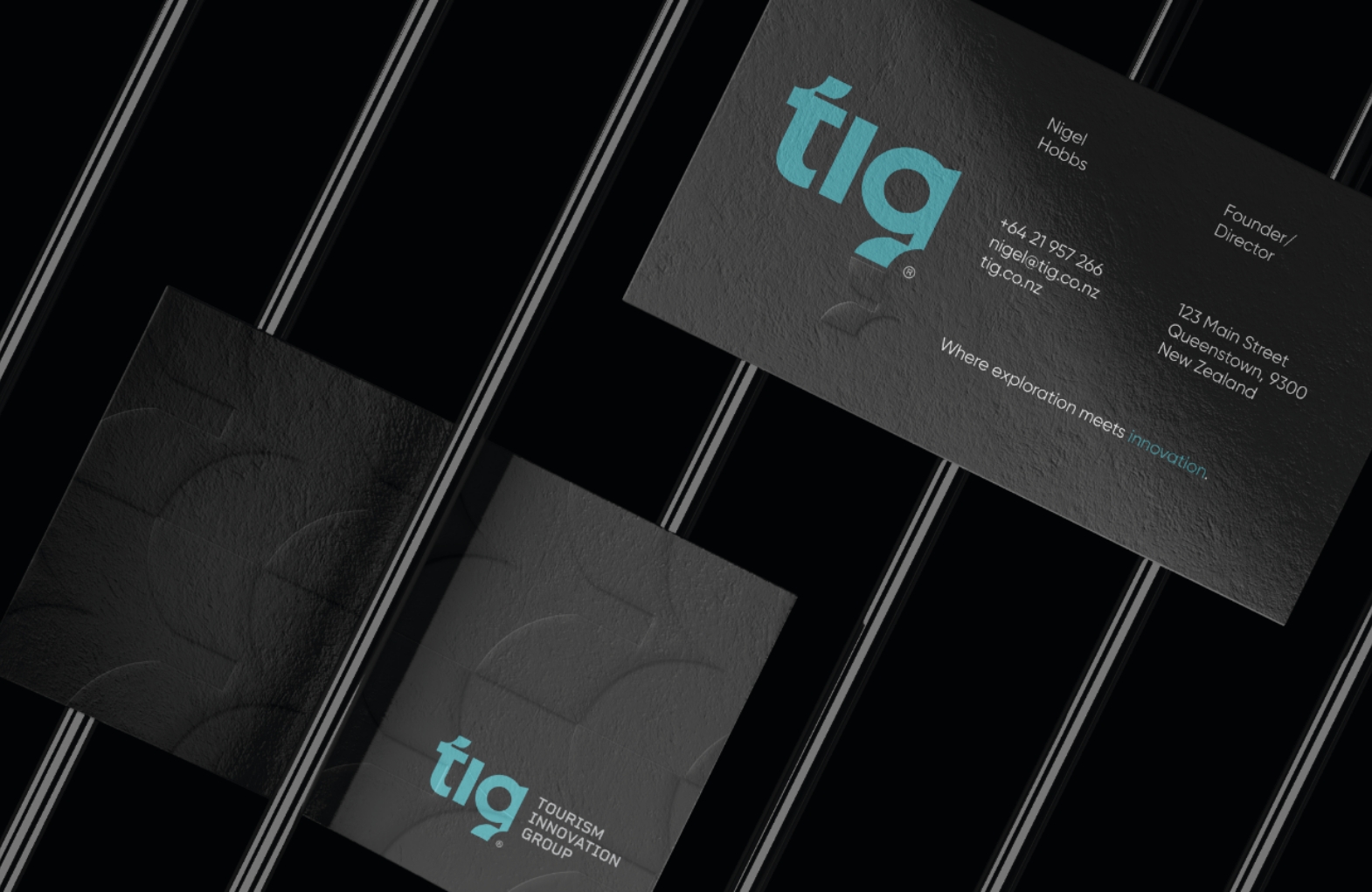
Tourism Innovation Group
Where exploration meets innovation.
Brand /
Strategy /
Web
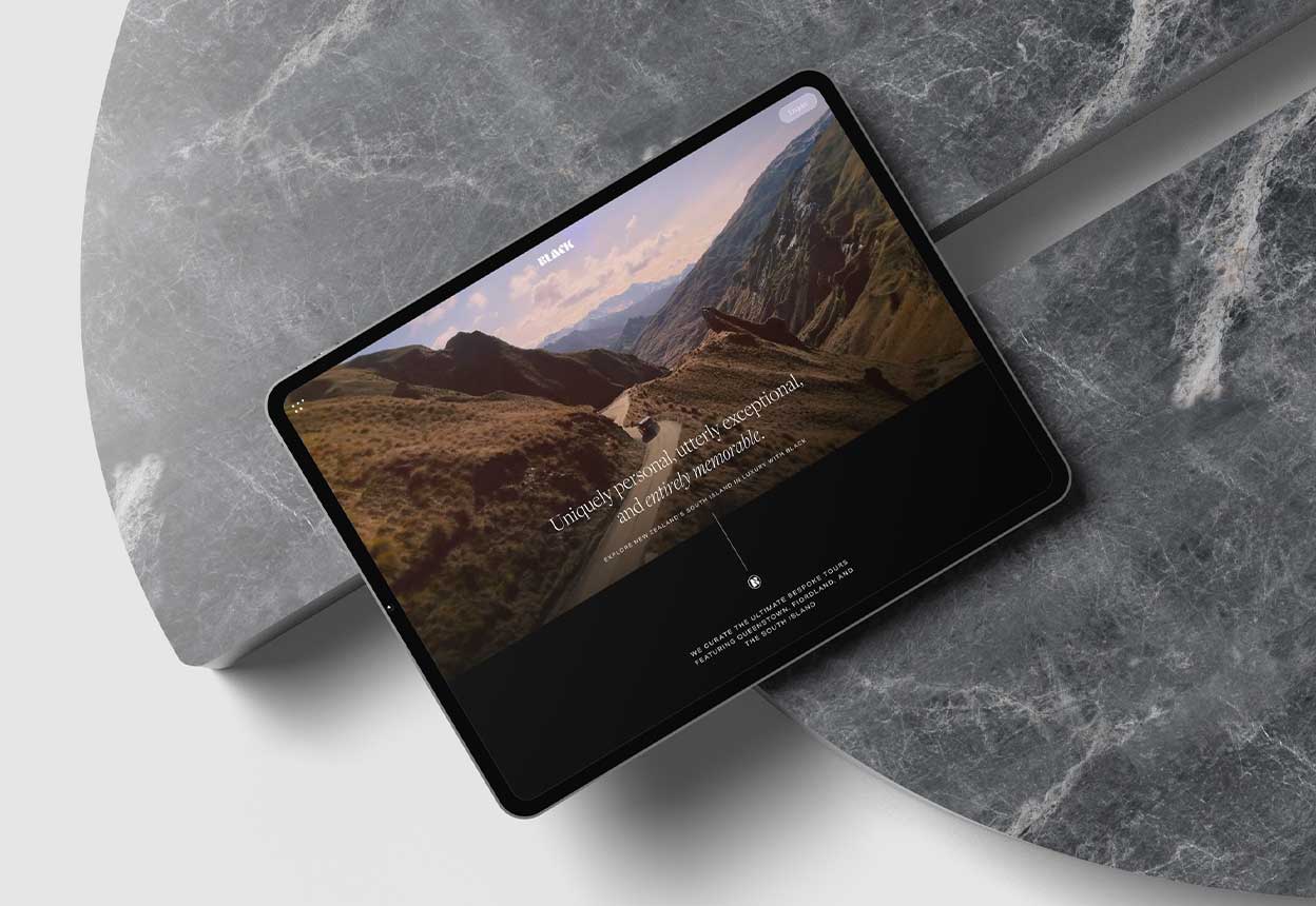
Black
Luxury experiences inspired by you.
Featured /
Web
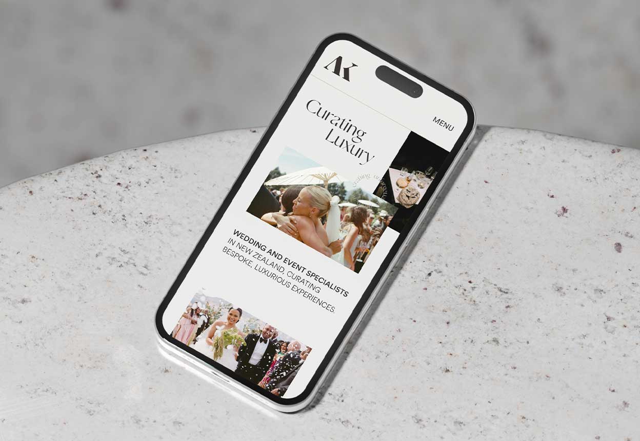
Alexandra Kate Creative
Elevating elegance.
Featured /
Web
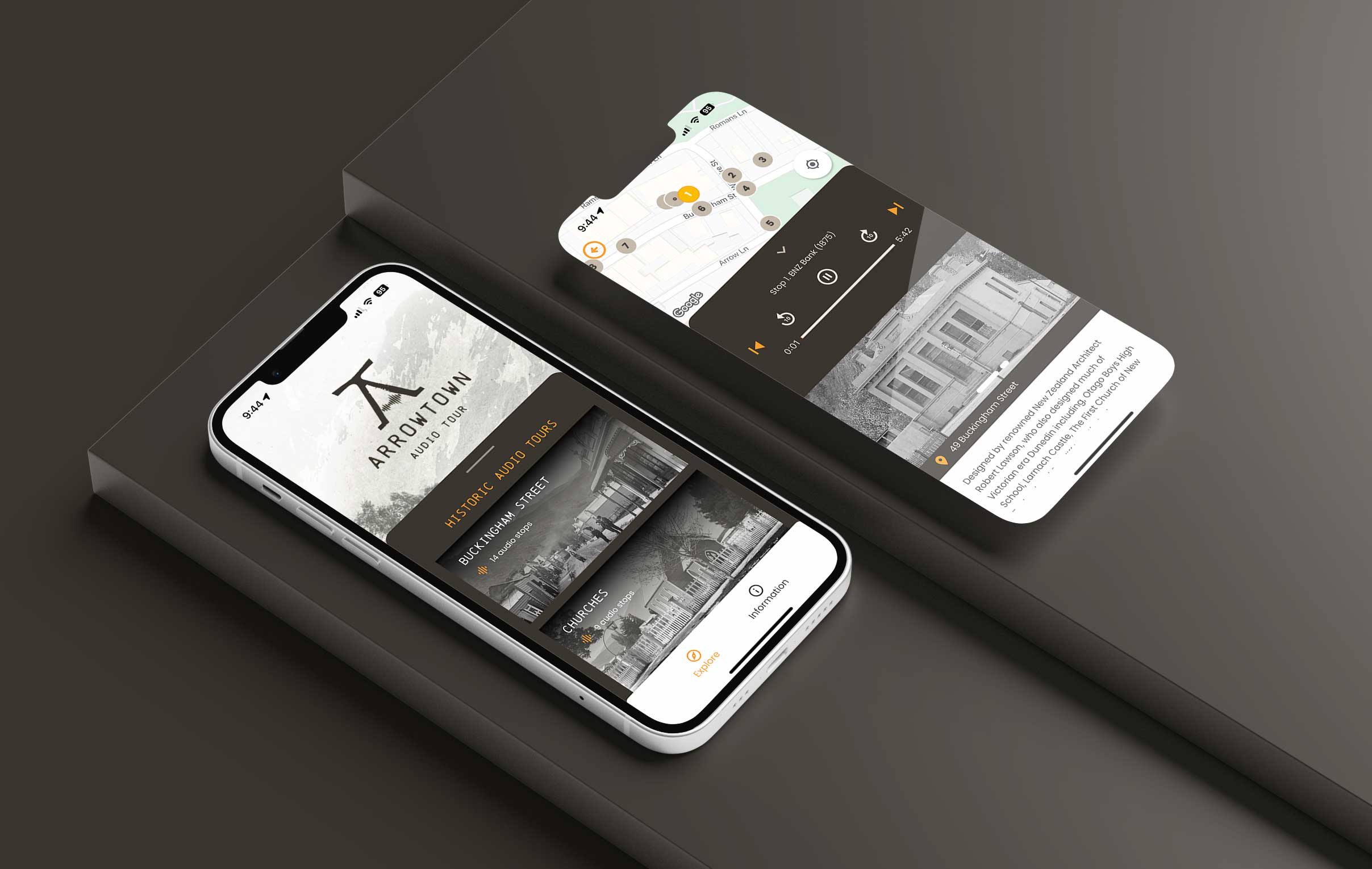
Arrowtown Audio Tour App
Stories designed to move you.
Brand /
Strategy /
Web
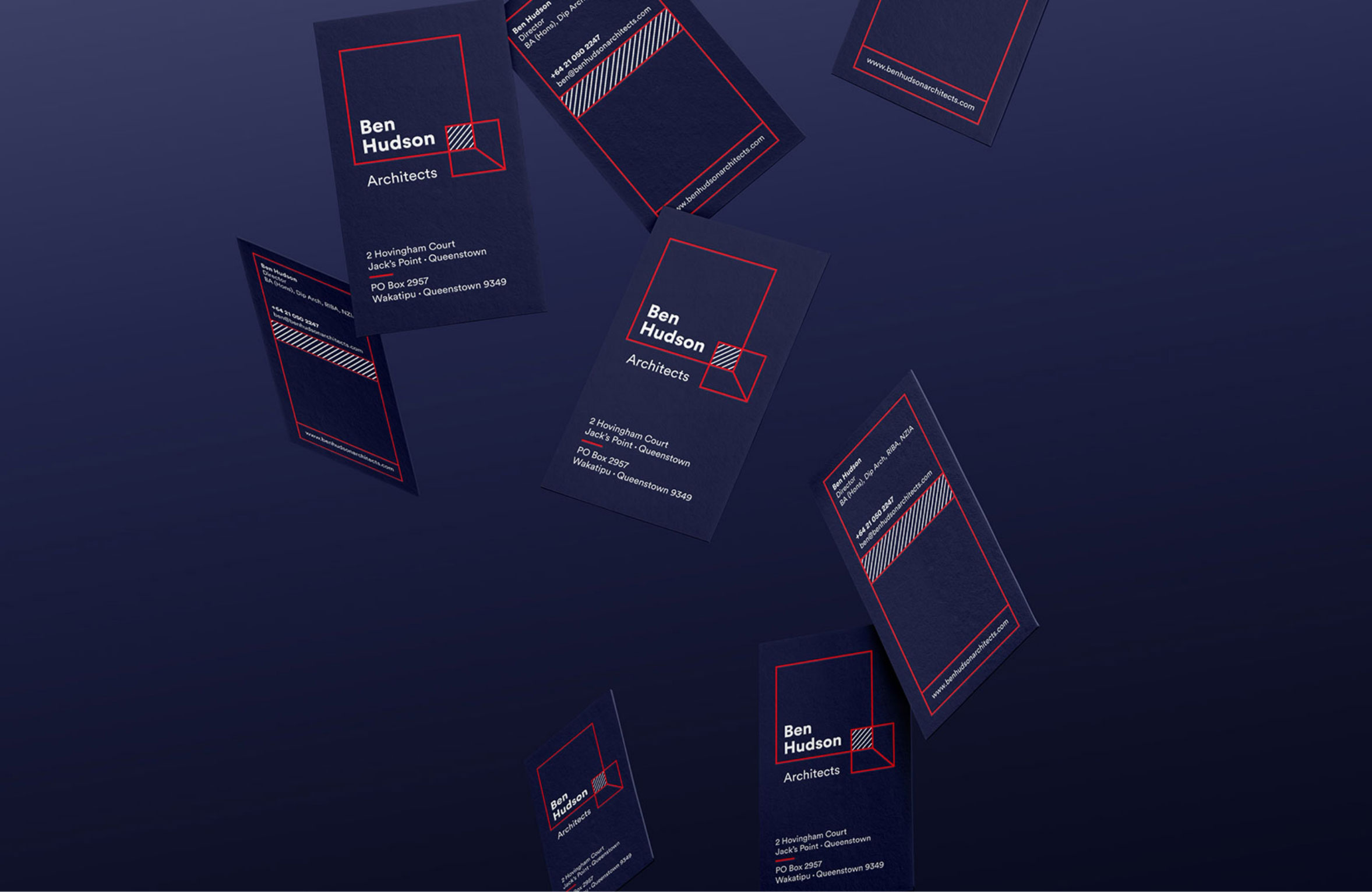
Ben Hudson Architects
A warm approach to fine living.
Brand /
Strategy /
Web
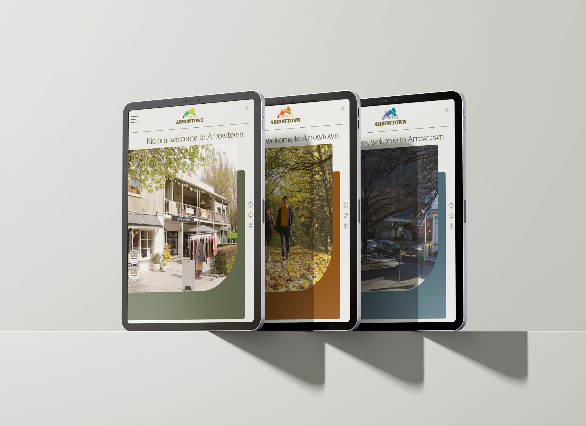
Arrowtown
Redefining Arrowtown’s digital gateway.
Strategy /
Web
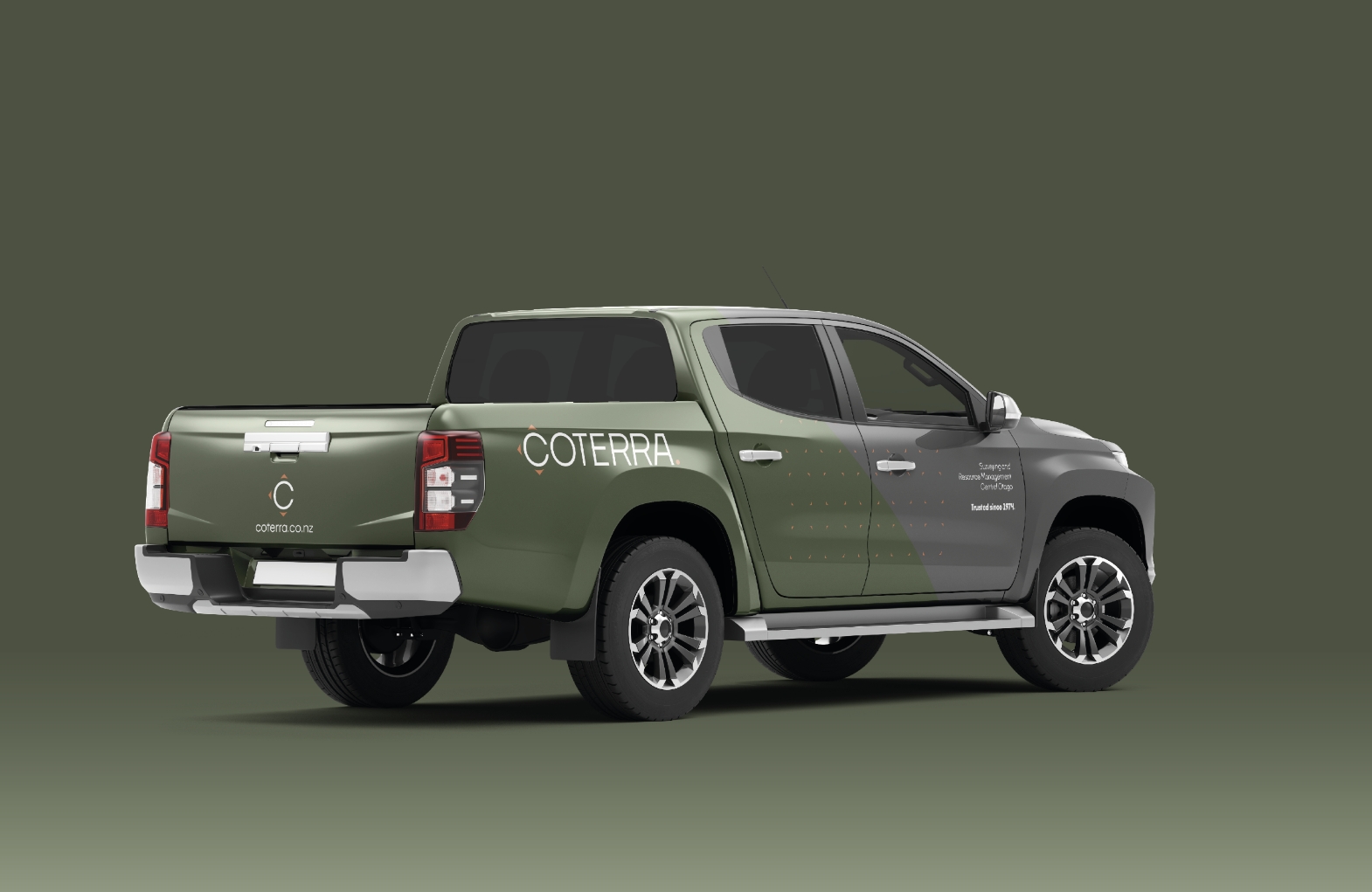
Coterra
Unlock the potential of your property.
Brand /
Strategy /
Web
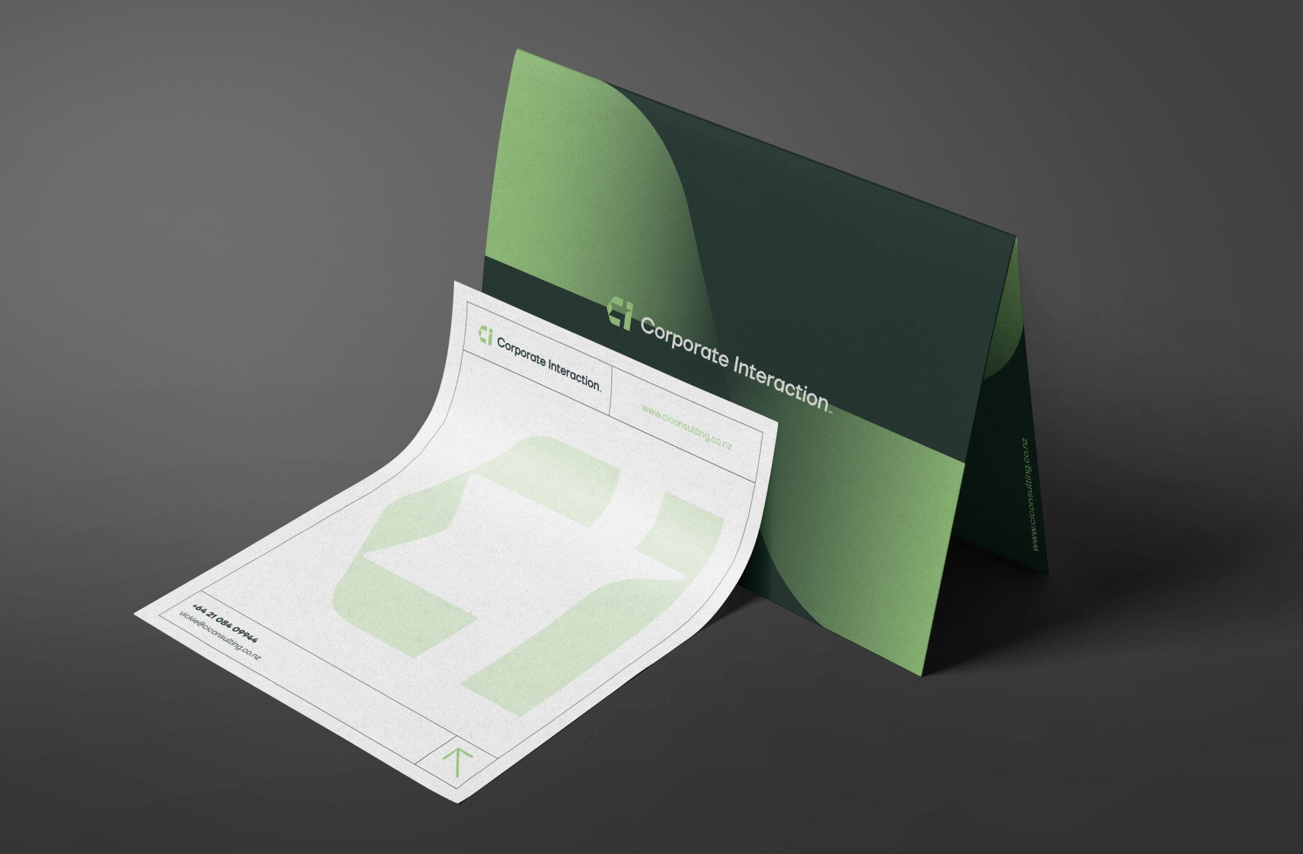
Corporate Interaction
Beyond consulting.
Brand /
Strategy
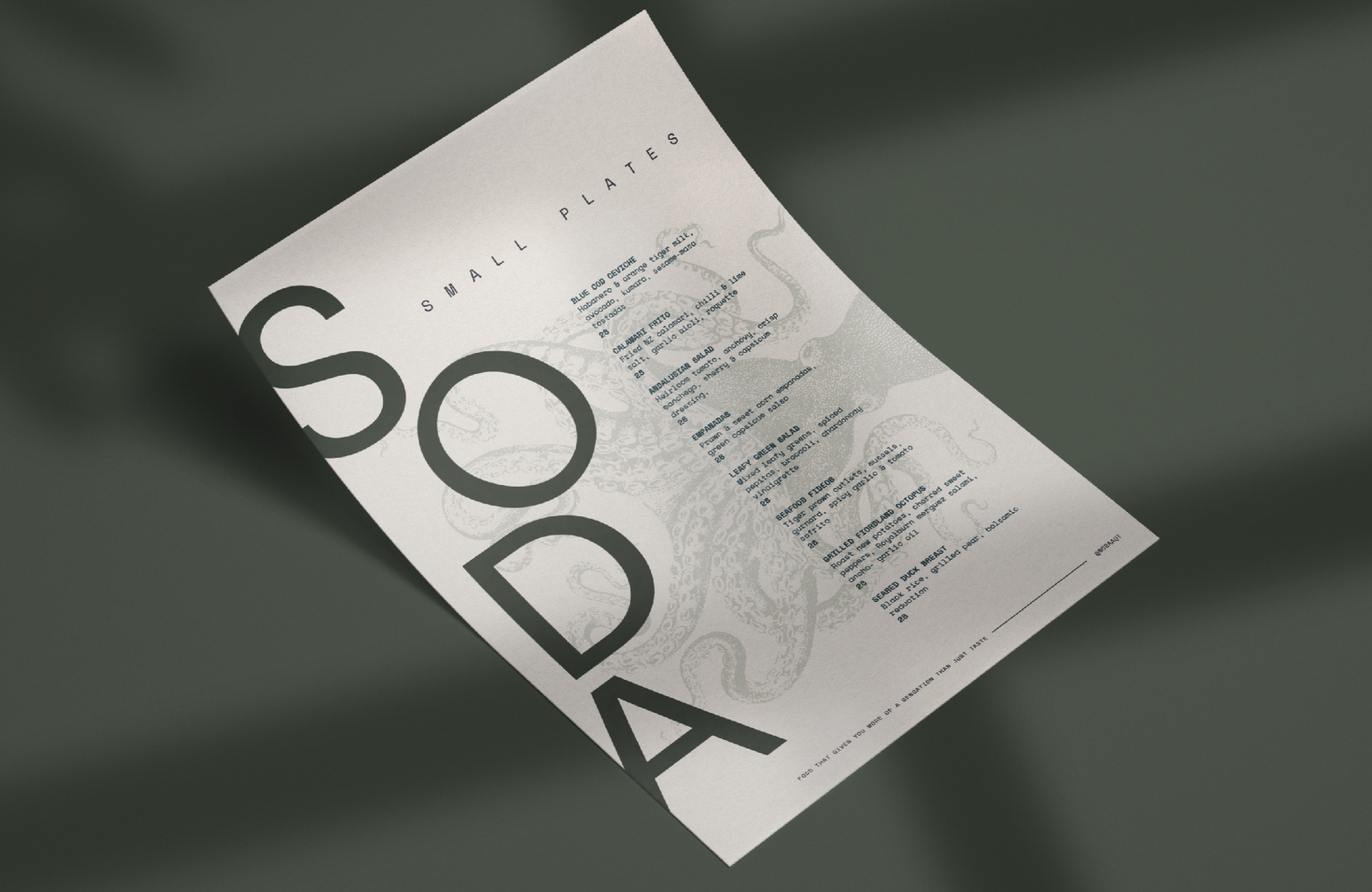
Soda
We savour to watch the sunset.
Brand /
Strategy /
Web
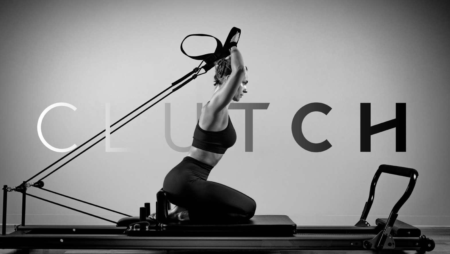
Clutch Reformer Pilates
Made to move.
Brand /
Strategy
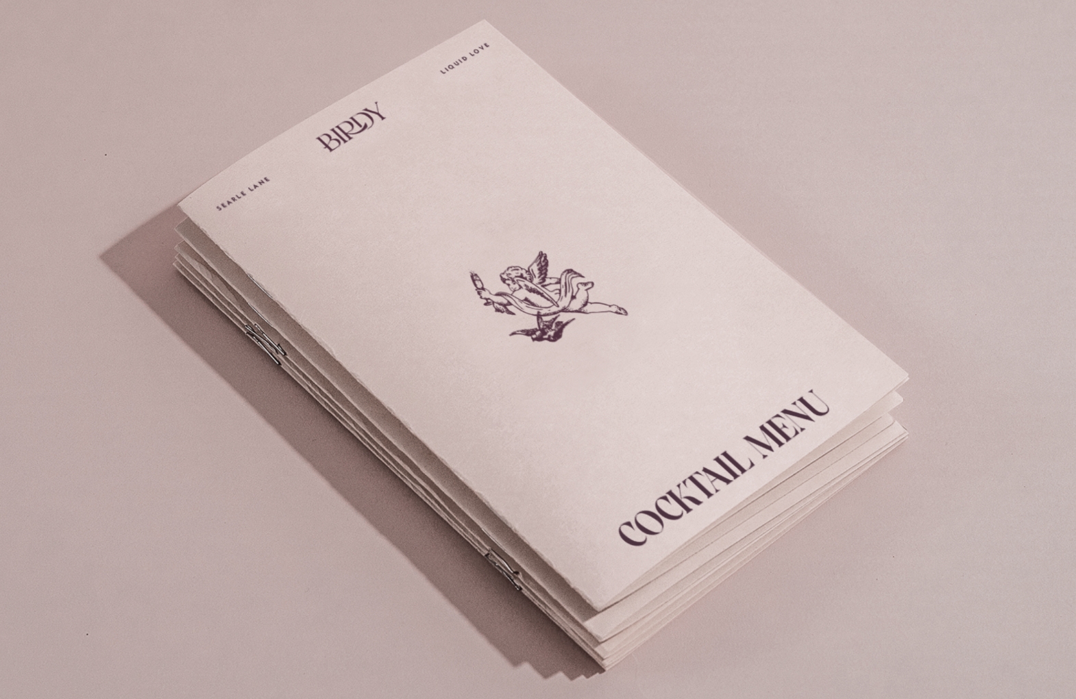
Birdy
Where fizz comes first.
Brand /
Strategy /
Web
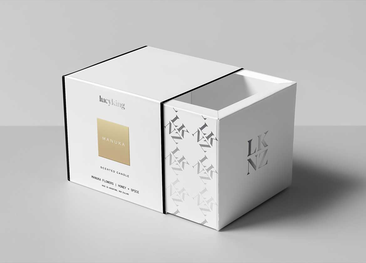
Lucyking
A sensory journey around New Zealand.
Brand /
Featured /
Packaging /
Strategy
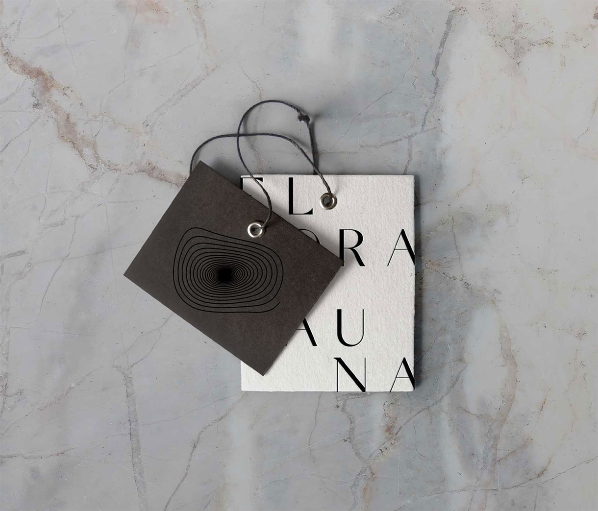
Flora Fauna
Out with the old, in with the odd.
Brand /
Strategy /
Web
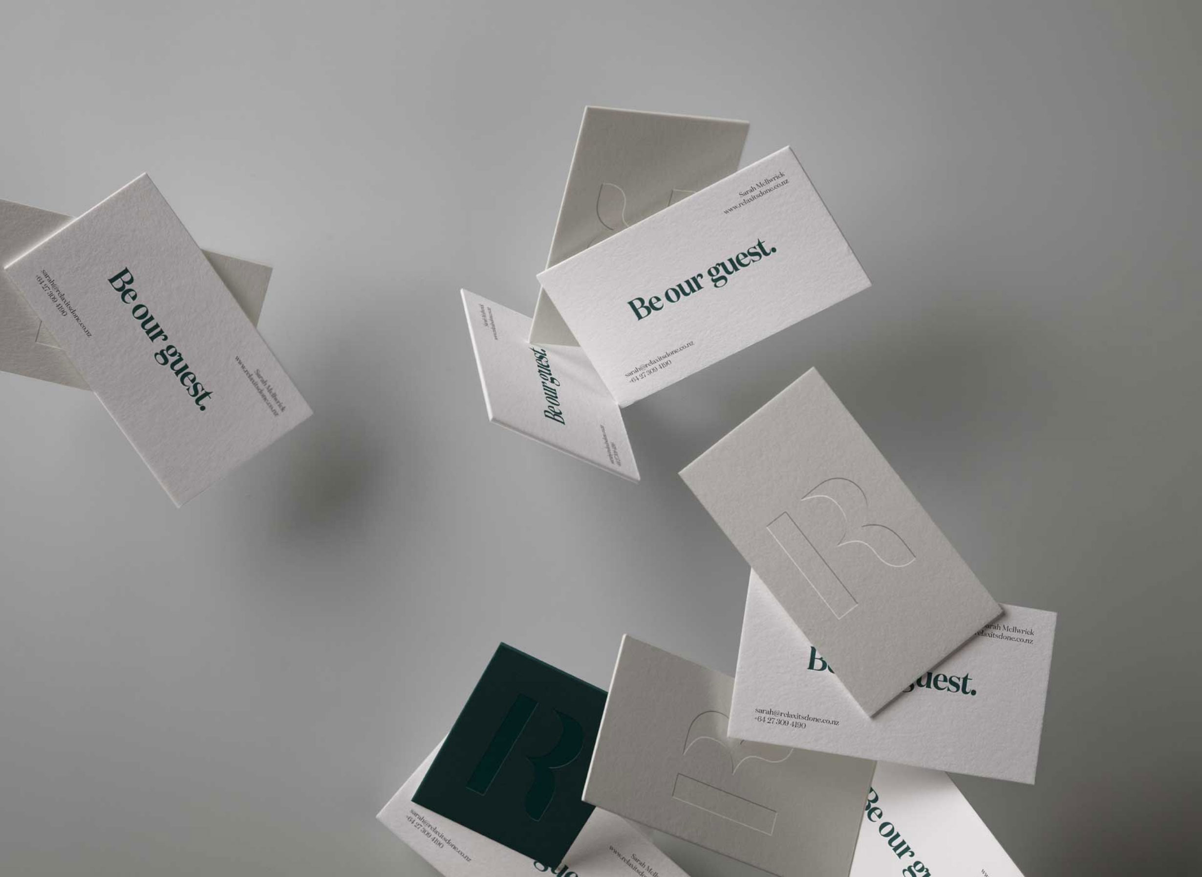
Relax It’s Done
Be our guest.
Brand /
Strategy /
Web
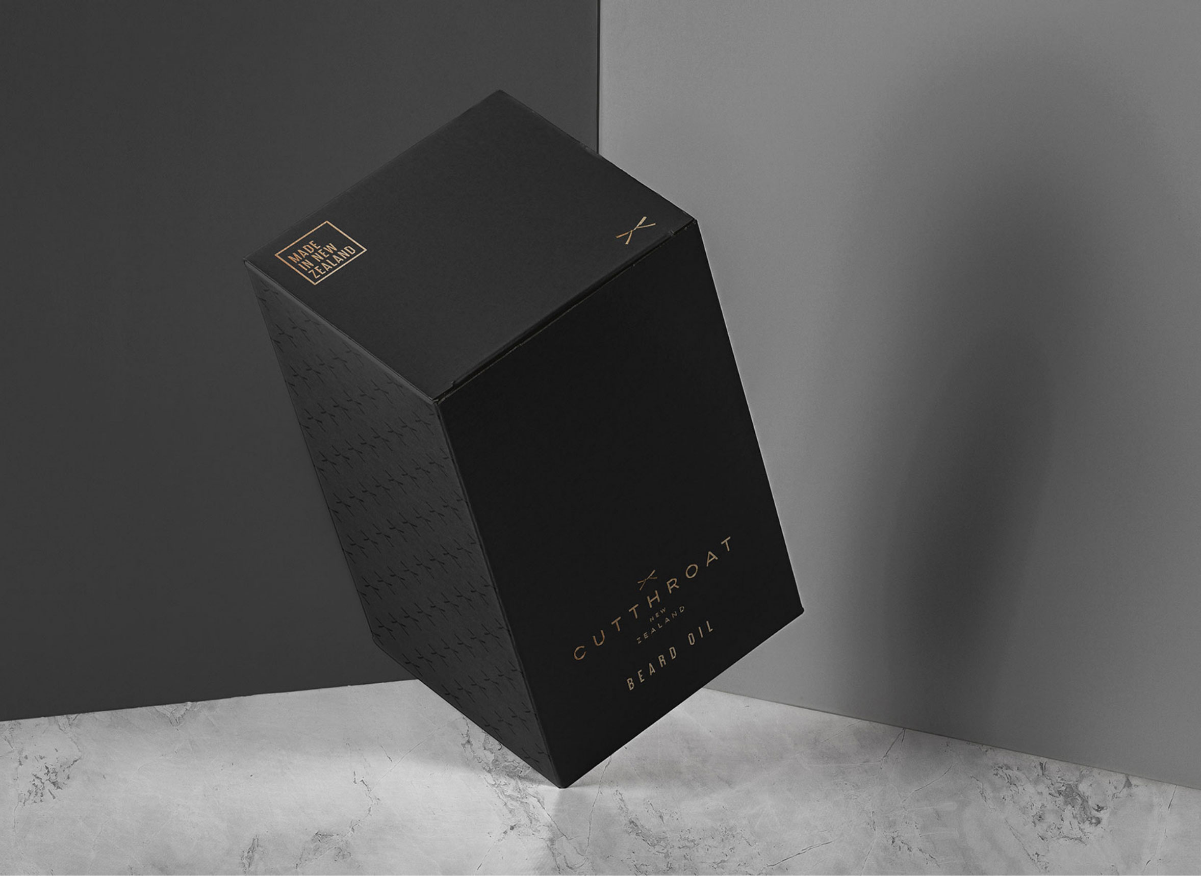
Cutthroat
Catering to the urban beardsman.
Brand /
Packaging /
Strategy
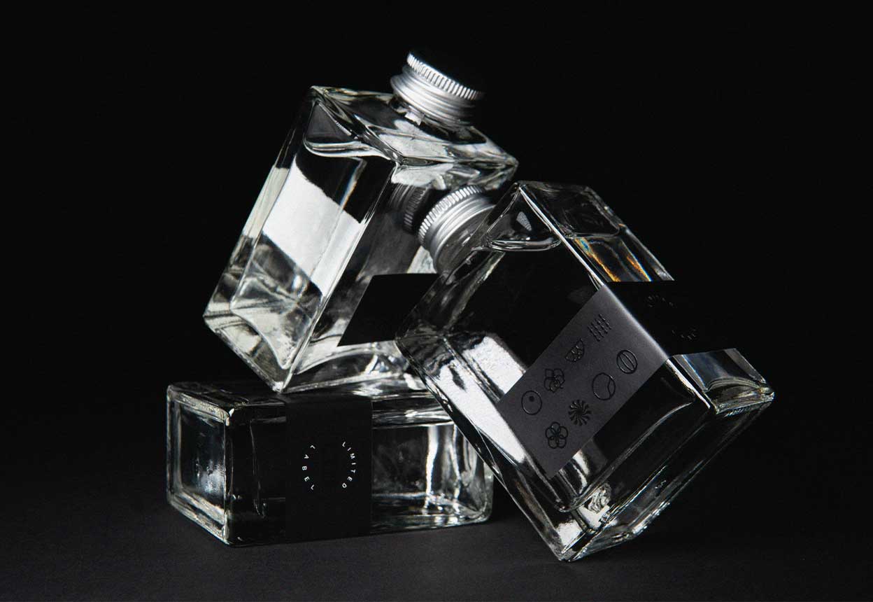
Limited Label
For lovers of gin and art.
Brand /
Featured /
Strategy /
Web
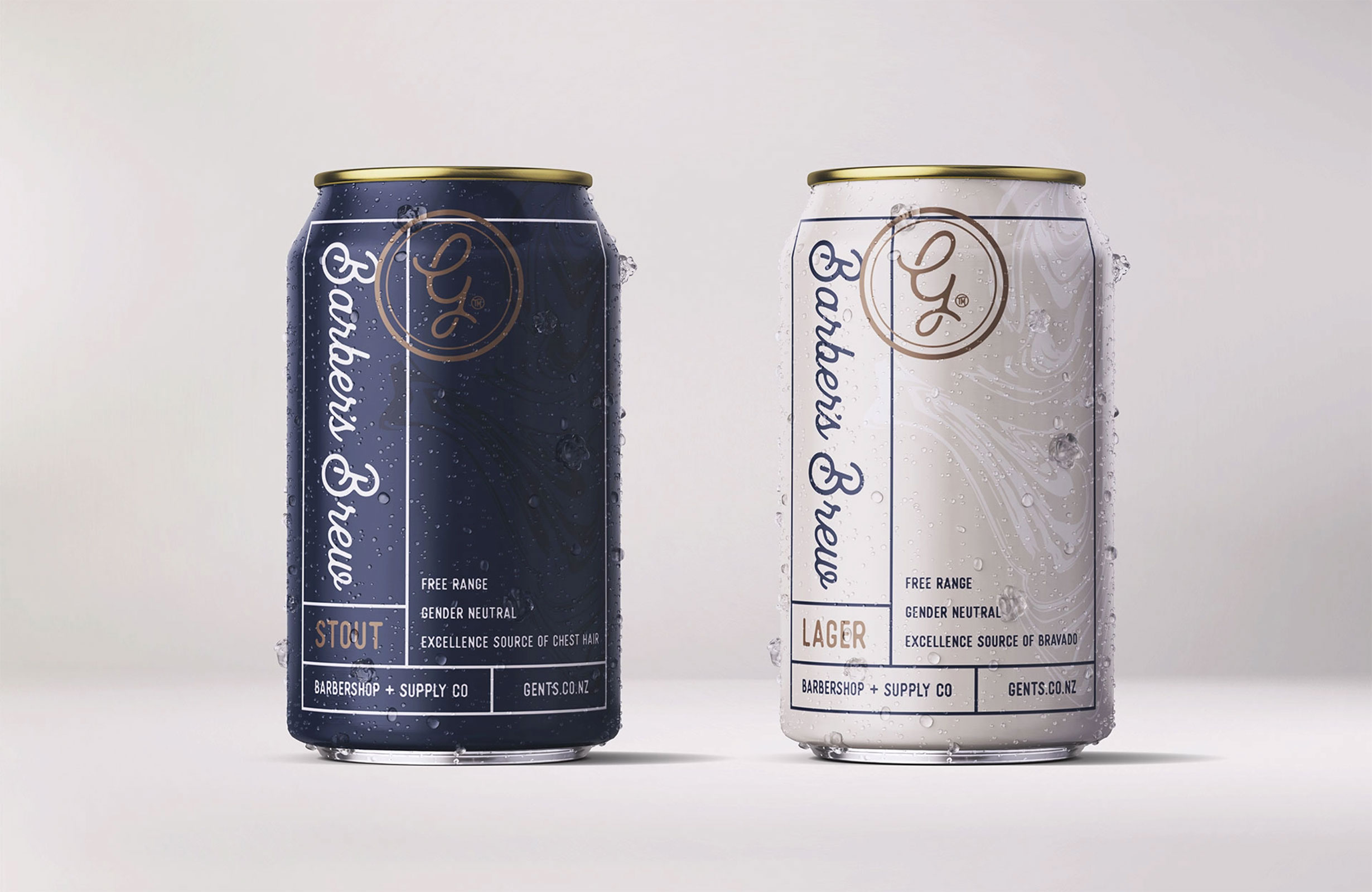
Gents Barbershop
Behind the whisky smoke and mirrors.
Brand
Dart Engineering
Delivering innovative solutions.
Brand /
Strategy
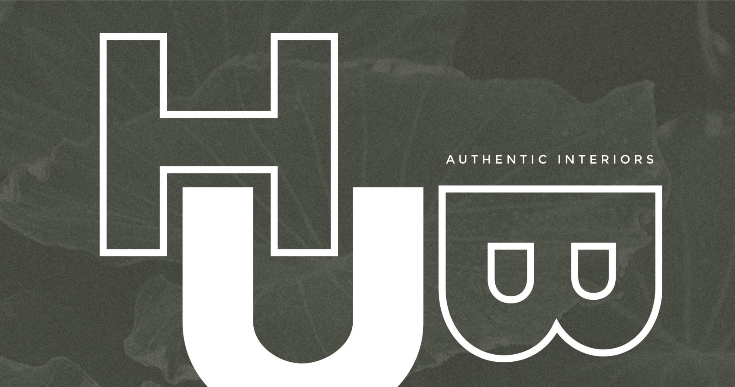
Hub Design
Authentic Interiors.
Brand /
Strategy /
Web
Iron + Ivy Studio
The power of juxtaposition.
Brand /
Strategy /
Web
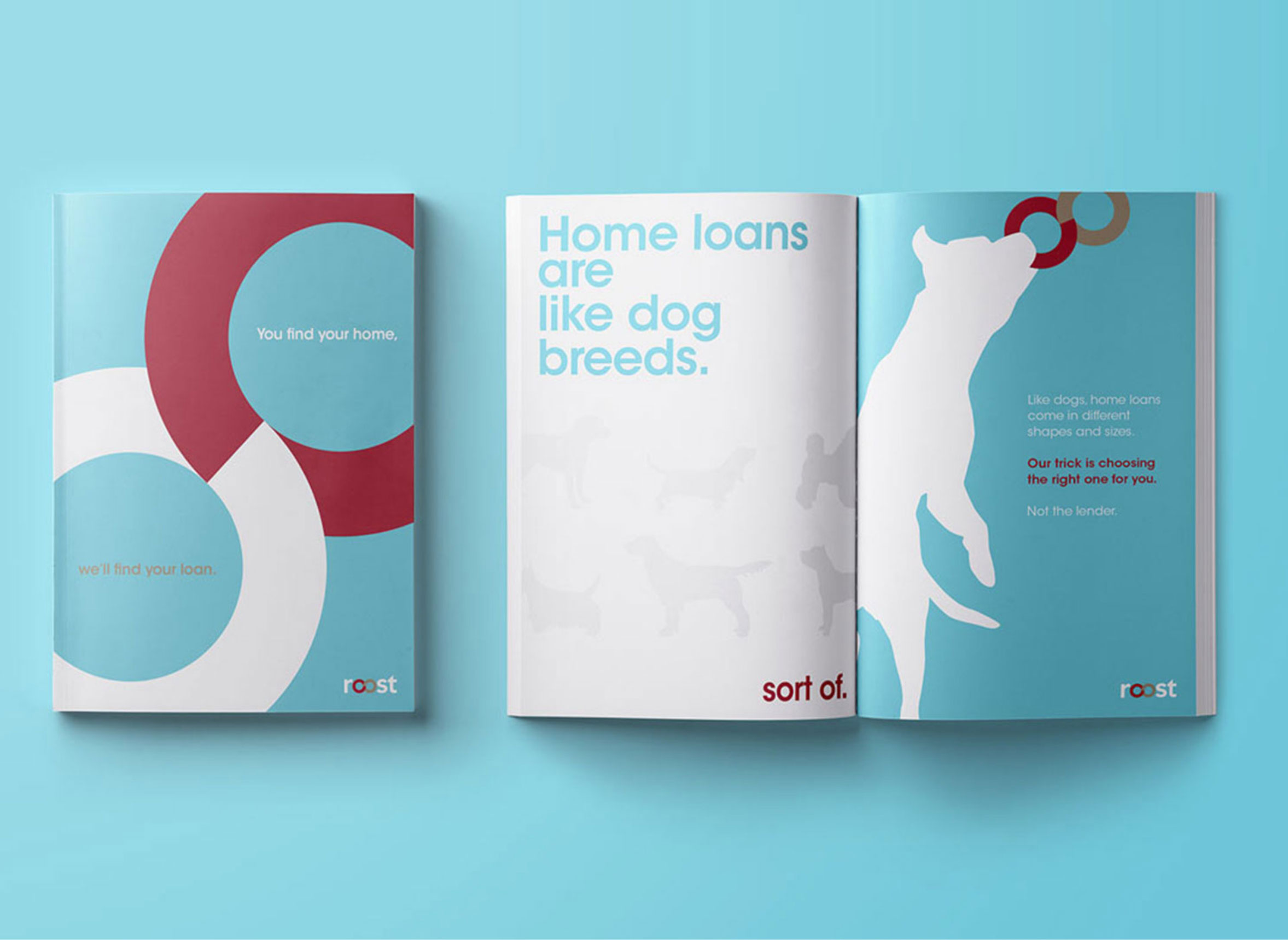
Roost
Value the best, leave the rest.
Brand /
Strategy
Hallmark Homes
Where every home is a showhome.
Brand /
Strategy /
Web
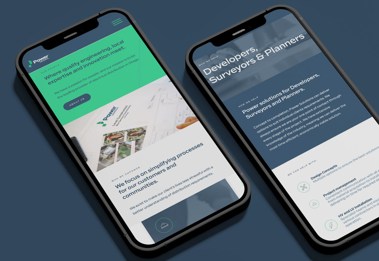
Power Solutions
Powering the way forward.
Brand /
Strategy /
Web
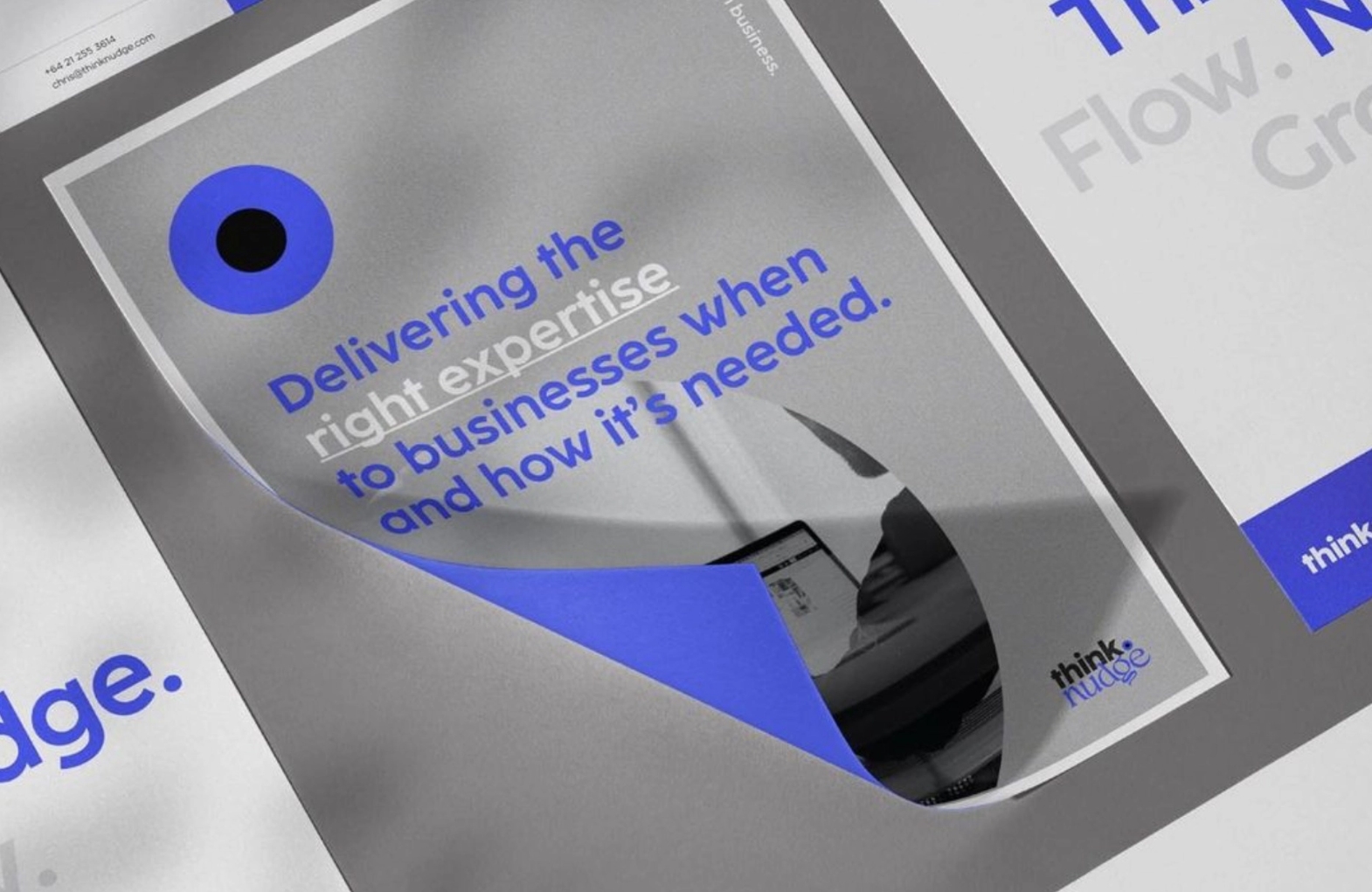
Think Nudge
By your side in business.
Brand /
Strategy
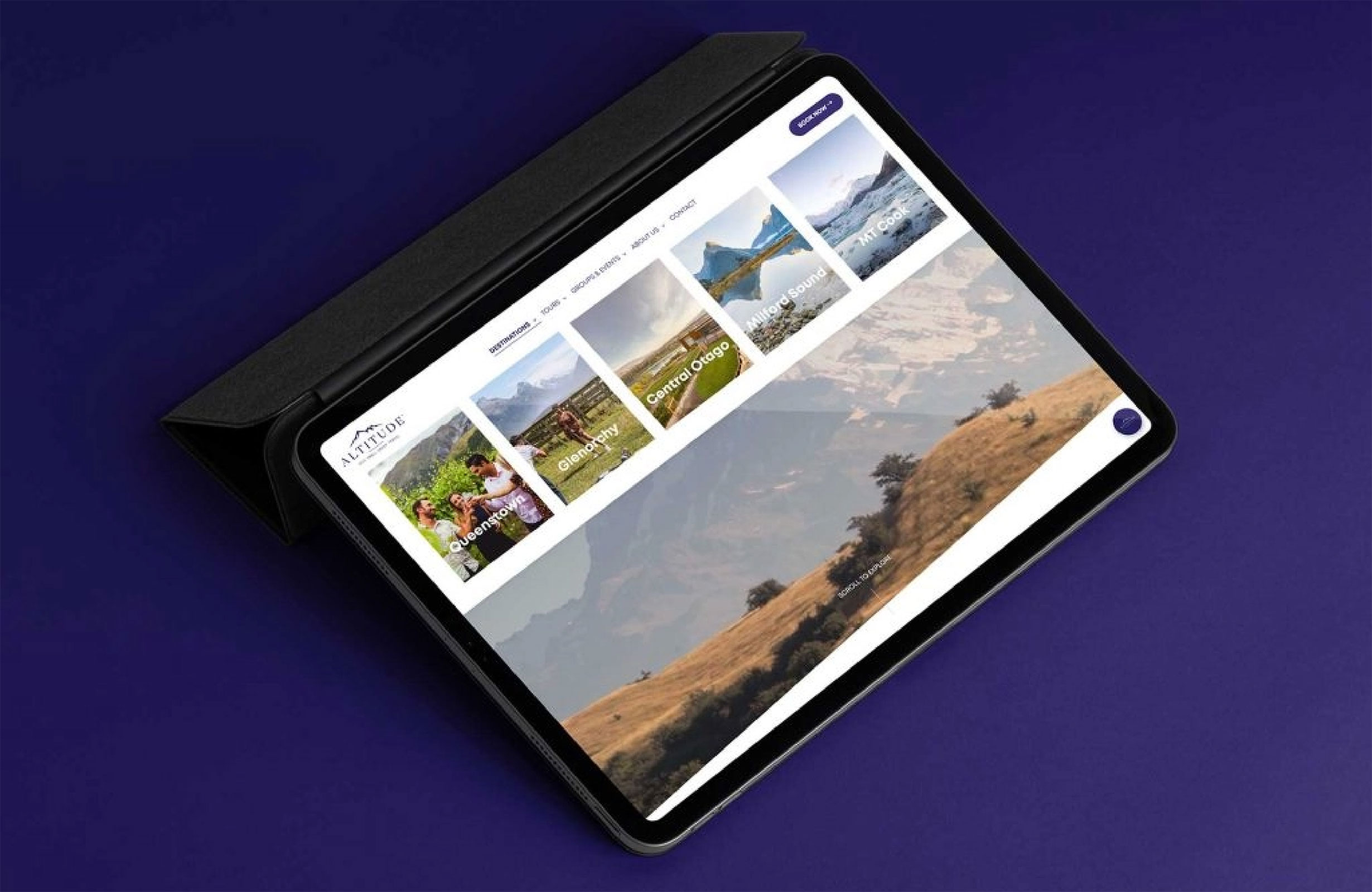
Altitude Tours
Small groups. Big adventures.
Brand /
Strategy /
Web